Saturday, February 25, 2017

Backstage Pass February: Samantha Davies

Look What We Got For You! A Backstage Pass! 

In This Month Of Love, We'd Love You To Meet Samantha Davies!

Samantha, Why Don't You Tell Us About Yourself?


I’m a UK comics artist who studied animation but is bad at being told what to draw


Main Projects

Stutterhug - an ongoing collection of all ages short silent comics, containing many hugs and awkward looks. Can be found on Twitter, Tumblr and Patreon


The Shape of Things- an upcoming longer comics project, the first and second parts are up.


Other Hobbies, Guilty Pleasures and Obsessions


Reading fantasy, learning weird animal facts, ghost stories, great white sharks and the dumbo octopus.


So, tell me about your early experience. How did you fall in love with telling stories in pictures?


I didn’t have access to print comics in my town as a kid, but I discovered webcomics as a younger teenager and got caught that way.
 I started trying to learn to draw largely because people online showed it was possible to improve over time, before that I assumed it was just a talent you were born with. It took a long time before I found a way of making comics I was comfortable with, and I’m still learning every time I draw one.


What media and programs do you work in to produce your project?


I thumbnail and sketch with pen on lined paper, then I do all my final work in Manga Studio.


Can you tell me about your typical day or strip-creation session? How does your work process flow from idea to finished page?


Every comic starts with my thoughts wandering about, usually during a walk or on a bus. I’ll have an idea and jot it down in my notebook.Sometimes it’s months before I come to drawing it, sometimes I’ll want to do it straight away, depending on how clearly I can see how it will work as a comic. I sketch very scribbly thumbnails on paper, then sketch and ink the final version in MS.

What’s the most difficult part of your work?


Colouring! even though it’s so minimal, I can sometimes take a long time before I find a colour scheme I like, and will often recolour the first page several times over.


Can you tell me about your storytelling process? Do you prefer to script your stories, fly by the seat of your pants, or somewhere in between?


Between, I never draw a final comic without an idea to start from, but I usually only have a few words to a sentence in my notebook describing the comic. Something like ‘Wolves howl to welcome someone home’ or ‘appeasing angry demon rabbit’ The details are all worked out in the sketching.


Where do you draw the inspiration for your skit-like strips?


Animation is a big one, obviously. While studying it at university we would watch lots of 1940s and 50s shorts, I’d find the character designs, posing and draftsmanship beautiful, but the stories didn’t connect.
 I think I tried to do a version of that style if gestural storytelling with the sorts of things I wanted to see. The ‘Infinite Canvas’ approach lots of webcomics folk make use of was the other big one for me, I ditched the idea of pages and just go on and on until the story is done.


Your strips often feel they’re telling readers something important about love and relationships a la Aesop’s Fables. Do you work with a moral lesson in mind?


I think I’m often trying to teach myself a lesson I should already know, but keep forgetting! Or sometimes it’s something I’m trying to work through but don’t have an answer for. All of them feel embarrassingly personal when I read back.


How much of a buffer do you like to keep?


I like to be two strips ahead, but I’ve worked with no buffer a couple of times, which fills me with dread. If I think of a longer idea (15 pages +), that can mess up my schedule completely - and I do that quite a lot :I


What message do you hope readers take away from your work?


Something hopeful, or maybe just that moment of ‘I feel this way too’

What keeps you devoted to telling the story you’re telling?


Compulsion! I just keep doing it and start feeling weird if I go a week without working on a comic. Send help, please.

Thanks For All The Sweet Moments Samantha!


Sunday, February 19, 2017

Dobble & Ed: A Door Revisted

Aliens among us! Doors to another world! Abominable snowmen! You think you’ve seen it all? Wait 'til you feast your eyes on…
Dobble & Ed: A Door Revisited


The Rating

For fairness’ sake, consider this rating to be…relatively arbitrary. This is a spin-off of a pre-existing comic. Given the choice between seeking out the source comic or simply judging how Revisted holds up as a stand-alone work, I have chosen the latter.

The Raves

The first thing that struck me about this comic was how fast-paced the storyline is. If you want something that takes off like a rocket, boy is this the one for you! Right off the bat, you have an alien named Advice Box being taken away to another world right in front of his friends and they waste no time cooking up a plot to find him. That seems to be the main story, though a lot of other subplots are worked in along the way. In less than fifty pages, we see extraterrestrial portals, a living snowman with a grudge against our main characters, a woman toting a flamethrower, a strange alien world, and a rooftop battle against an evil pink rabbit! There’s always something going on and it’s always strange, unexpected, and gleefully silly.

The plot, which I’ll get to later, lost me a bit at several points. One thing that didn’t lose me, though, was the plethora of creative ideas this comic throws out at high speeds. The sheer insanity of this comic reminds me a little of the edgy, offbeat magic in cult classic cartoons like Invader Zim. It seems like anything could happen in this world. The chaotic setting is also paired with a slightly dry sense of humor, though usually more good-natured, rather than cutting. The occasional fourth-wall gag also sneaks in, for those who like those kinds of jokes.

To go along with the crazy setting, the art is also packed with a lot of detail and creative energy. I can’t help noticing how energetic the composition is. Something interesting is always going on. 
While the art style is simple, notice how everything looks to be in proper perspective. The machine in the foreground frames the characters and there are small details like carpet texture and photos on the wall to keep the room from feeling empty and stark.
The comic uses a very wide variety of angles to show the characters and their surroundings. Since I haven't read the source comic, I can't rightly judge, but it does seem from this page that the background art has evolved a lot over the years. I really like how the cityscapes look in particular. The buildings look properly three-dimensional and the perspective is usually correct, building an interesting skyline in the wider shots.

The Razzes

Part of what makes a spin-off successful is the ability to bring newcomers up to speed on the setting and characters. While I like the fast-paced writing, there were several points where I felt like the comic had lost me. It does go back and explain some things—for example, where Advice Box came from, and how Andy the Snowman came to be—but there are also a lot of parts where I feel like I’m missing too much context to be fully immersed. No doubt a fan of the main series would get way more out of this comic, but as an outsider, I don’t feel like I’ve been given a proper introduction.

The biggest problem is the characters. It’s obvious they’re already established from the main story, but here, I can barely get a feel for them. I don’t have much of a grasp on their relationships or why the main human characters care about getting Advice Box back. From there, it feels like a flood of cameos that get only the slightest continuity nods. 
You know how they say "show, don't tell"? This is telling me about the character, but it's not showing who he is.
Characters just come and go with minimal context. Andy the Snowman is probably the most well-developed character so far, being a grouch with a clearly-explained backstory and motivation, but most everyone else seems like too much is missing for me to feel all that invested in them.

With that out of the way, let’s talk about art. First, I want to point out a problem with the lettering.
You see that? That’s not a thing that should happen. You gotta give your words room to breathe! Don’t let them get so close to the edge! Not every word bubble has this problem, but it still happens quite a lot. Also, consider the shape the text forms. It should be roughly in a diamond pattern. Most of the word bubbles do exactly that, but I've seen more than one instance of text lines being uneven in this comic. Try to avoid that.

As for the rest of the art, though I like the composition, the linework and colors leave much to be desired. For one thing, the lines are a bit on the sloppy side and lack any variety in weight. Even a little bit of variation on the line weight can make a big difference. Try starting with using slightly finer lines for smaller or more distant details. Add a little more thickness on lines near a shadow. If you want more in-depth information on line weight and how it effects a drawing, check out this video.
As for the colors, they’re flat and murky. The shadows look as though they’re made by adding more black to the base color. There aren’t any highlights either. I’m not saying the comic needs to start doing a bunch of fancy blending, because with cartoony art, usually less is more. but try throwing in a highlight here or there and use richer hues for your shadows. Combine that with some variety in line thickness, and you’d be amazed at the difference.

Finally, it seems the characters are very stiff. They look like posed action figures most of the time. Since this is such a cartoony art style, giving advice on human anatomy won’t help much here. In this case, I actually think the best thing to study would be animation. Here's some fun homework; watch a whole lot of Looney Tunes and look closely at how the characters move from frame to frame. Pay attention to the subtle movements, as well as the big, exaggerated ones. And if you see a pose you like, reference it! 

If you're wondering how they do some of this, take a look at this tutorial on walk cycles. Most of the later steps won’t apply to your art, but notice how before the animation itself comes into play, the person writing the tutorial takes time to talk about the torque and basic shapes of the body?  These kinds of tips can help you get some ideas on what a body looks like in motion and how to capture a single “frame” of that movement. Take some time to read up on the line of action, too, since having a grasp on that really does make all the difference in drawing good poses.

The Revue

As I mentioned before, my review is strictly judging the comic on how well it holds up as a stand-alone comic. So how well does it?

Not too well, in my opinion. The story is a bit half-baked and the art, while visually interesting, has a lot of weak points. Whether the comic would be better for having read the main series isn’t for me to say. If you're interested in seeing more of Wes Parham's work, you can follow him on Tapastic.

Saturday, February 18, 2017

Heroes of Thantopolis


Ghosts and ghoulies! The dead are everywhere!
Lock your doors! Bar the windows! Make sure nobody can get inside…


…so nothing can distract you from reading Heroes of Thantopolis, a cute lil’ comic about ghosts and friendship.

The Rating

This comic tries so hard. Its gentleness and kid-friendly nature make it endearing enough that I can’t truly dislike it, but there are still some notable flaws.

The Raves

The long and short of Thantopolis is this; Cyrus, a living human being, finds himself in the city of the dead, Thantopolis. He can’t remember his family or who he was. Upon meeting Helene, Goddess and Queen of the city, Cyrus is recruited as her champion and given a weapon. And so proceeds the story.
If there’s one thing I really like about this comic, it’s how vibrant and colorful the art is. The color choices are pleasing to the eye. There’s a big emphasis on curves and soft forms in the comic, giving the art a whimsical feel. Given that Thantopolis is intended to be kid-friendly, these are fantastic artistic choices to make.

The kid-friendly nature of the comic is itself also a praiseworthy trait. It’s relatively uncommon to find a good long-form webcomic that remains firmly in the realm of the G-rating. It’s even more uncommon to see such a comic that deals with topics of death, identity, and personal conflict. Although some aspects of the comic are lacking in development, the younger ends of the target audience would probably find this to be an enjoyable read. No doubt adults can and do enjoy it as well, but it holds up a little better for a younger crowd.

The relationships are probably the strongest part of the writing. There’s a huge emphasis on friendship, camaraderie, and mutual understanding. The relationship between main character Cyrus and Xisea, a friendly little spider ghost, is so unrelentingly sweet that I honestly felt a little happier just seeing them talk to each other about their problems. It's by far my favorite aspect of the writing. Not every relationship in the comic is written quite so well, but when the creator nails it, they nail it.

The Razzes

Let’s start with the art. While I like the color choices, I’ve got some beefs with the character design. There’s nothing wrong with having a simple art style, but this one is sometimes simple to a fault. It reminds me a bit of the Cartoon Network style. You know…

that style. And if you’re a fan of that style, you’ll like this art. The real problem here is the main character looks so forgettable and generic, while most of the others look nothing like whatever they’re supposed to be. For example, this character…

…is a rat, but looks more like a cat. And it only gets worse from here.
This is a spider.

This is a crow.

This is a hunting hound.

This is Sagittarius.

I think she’s supposed to be a horse? I can only assume that since Sagittarius is typically depicted as a centaur. I’ll admit the art is cute, but it starts to get a little stale when almost everybody just looks like an indistinct blob.

Now onto the writing. Oy, the writing. Let’s start with character interactions.

Admittedly, I like how sweet the main character is and the relationship he has with Xisea is endearing to no end. Those two have probably the most likeable personalities in the comic. I also admire some of Trickster’s quirkiness, though sometimes his ‘90s Bro persona can wear a little thin. Cyrus, Xisea, Trickster, and later Sagittarius become a core group of mutual friends through the course of this comic and there are some very nice moments between all four of them. What really annoys me, though, is Helene. By all rights, she is the major cause of most of the main character’s problems and the comic doesn’t pretend she isn’t a master manipulator.
Cyrus has more goodwill for Helene in his little finger than I do in my entire body.
So why is she presented like some kind of mother figure to Cyrus, whom she treats as her personal pawn 24/7? I’m tempted to think the comic is intentionally mixing its signals so that it’s hard to pin her down. Only time will tell. But in the meantime, her arrogance, dishonesty, and callousness really get on my nerves. Every time the comic gives her a “nice” moment, it feels forced, rather than earned.

The plot also has some big flaws. The setup and summary lead you to think that Cyrus’ journey will culminate in him confronting Aquarius. He’s being groomed to fight her, given a weapon, and a small team of friends who seem like they will help him. I was actually excited when it seemed like the climax was nearing, albeit puzzled because the archives showed I was only halfway through the comic.

Surely, the confrontation with Aquarius, which was played up as a major event and Helene’s reason for recruiting Cyrus, would have some kind of complication and the plot will go on from there. Well, as it turns out, the real Aquarius has been held captive by an impostor. This should make for an exciting battle, right?

Nope. Cyrus “defeats” her by talking her down and convincing her that what she’s doing is wrong.

As with Helene’s “nice” moments, I feel like this is yet another instance where the moment just feels unearned. While I respect the message of using words and kindness to reach out to a villain, it all happened much too fast. With a few “words of wisdom” from our hero, she has a complete change of heart that takes all of two pages. On the whole, the entire climax of this arc just seemed cheap.
Since then, the plot has shifted gears to focus more on Cyrus trying to remember who he was, and the progression of that story has been a lot more believable, but the pacing of the comic mostly meanders and struggles to find a focus. Cyrus has a goal, but thanks to Helene’s obstruction, that goal is constantly pushed off to the side. But to what end? There seems to be no other particular aim and I can’t help wondering why Helene even keeps him around.

Y’know, aside from not wanting to part with her pawn.
You did not earn that hug. Put it back down where you found it and go sit in the corner.

The Revue

If there is one thing that this comic has a lot of, it’s heart. I can see that the creator has put so much earnest care and effort into this comic, even if the results are flawed. Regardless, if you’re looking for something colorful, kid-friendly, and generally pleasant, this isn't a bad story to check out.

Saturday, February 11, 2017

Spacebox

Ladies and Gentlemen!
Today I present you...
A man trapped in a box!
In space!


SpaceBox by James (no last name given) is about Tad Bardeaux and he is drifting through space in an escape pod.

The box has got everything to keep Tad alive. It doubles as a hypersleep chamber which slows his aging down. He has food and water through some hamster feedtube, and he has an A.I. to talk too, which looks like a red dot of light. If you're thinking HAL, you're close. It's VAL.

For a fully featured box that practically gives him immortality, it lacks one thing: a window.

How Tad got into this situation is never explained, but I found it a fun, quick read.


The Rating


No one will help you... in space.


The Raves

I enjoyed the premise of the story. It's melancholy, because Tad is stuck where he is. It's also funny because he happlessly gets into strange situations and manages to come out of it intact while causing terrible things to happen.


Tad can't see out of his box and can only receive second-hand information from various sensors and his AI. In a way, he's almost entirely shut out from any outside stimuli. He doesn't know what's beyond the box. It's a separate reality that bubbles him.

In the first story, some space mollusks latch onto his drifting box. When a large spaceship comes out of nowhere, Tad thinks he's rescued, except that these folks only intend to salvage his pod so they can sell it as a mint-condition museum piece with Tad trapped inside. The mollusks turn out to be xenomorphs that devour the crew and inadvertently in the ensuing fight knock Tad back out into space. The ship self-destructs and Tad is sent hurdling into the void.

The first scenario is like Alien, but viewed from the narrow perspective of someone trapped in a box. It's darkly humorous, seemingly random, and existential, but it fits with the idea of being adrift through the vastness of space.

Later Tad runs into a giant generational spaceship through a telepathic-dream connection with it's captain. It arrives several hundred years later to devour a gas giant which Tad is trapped in (pulled in by gravity). Tad once again believes he's saved but ends up getting thrown back out into space.

I like the minimalist constraints the story has. Everything in Tad's world is there out of necessity -- he's fed through a tube, he's put into hypersleep to keep him alive, and he has an AI to help him interpret the void around him. Constraints, when followed, also force the author to be more creative in their storytelling, and I was curious what would happen next to Tad in his box.

I like how time passes in James' story and how it plays into the enormity of space travel. Tad drifts for light years, but he also hypersleeps for centuries at a time. When he wakes up an epoch could have passed by and yet he's still the same. I'd love it if future comics played on this idea more directly. Like, what if he was salvaged and put up in a museum, went to hypersleep while on the ship, and awoke hundreds of years later to find himself in the middle of a museum with people gawking at him, and then wake up hundreds of years later to find that world decimated by some apocalypse, you know, like the beginning of Futurama where we see Fry in the cryopod and outside we see the rise and fall of humanity on a fast-forward timelapse.

Oh, and back in college when I was studying computer science, I had to code Conway's game of life. So I particularly liked this comic below. :)

I liked that the game of life is mentioned in this comic. :)
Not really much of a game you can play, but it was fun setting up initial conditions and watching the simulating play out, and yes, like the comic, you can get into some stable states and even iterative ones where each generation of the cells manage to keep living. I also suppose there is some correlation to the idea of Tad hypersleeping through centuries and the Game of Life being played out as a set of rules simulated over vast amounts of cycles on a computer.

The Razzes

This is one of those comics where if you judge it by it's art, you might pass over it. The website and art are simple and minimalist looking. There's literally nothing about the comic that catches the eye and makes you want to stick around. That was my first reaction when I came to the site. It seems bare and empty...like the vastness of space. Maybe the website could be dressed up a bit to enforce that idea with maybe a simple repeating startfield background.

The minimalist motif fits the story though. We have only the things that keep Tad alive and the details that we need to see.

I wish the panels were bigger. There is a cool shot of a generational spaceship that I wish had been bigger so we could see it better.

There's some issues with perspective too. For a comic about a box, literally the escape pod is a box, I would have hoped that it was drawn with a better sense of perspective, but sometimes the box appears warped in non-perspective conforming ways. Space may not have an up, but at least when drawn it there should be some kind of horizon line so we can anchor a vanishing point to it and give it the correct perspective.

The Revue

If you're looking for a quick and simple sci-fi read, then I recommend Spacebox. The idea is intriguing and I enjoyed the entire archive.

Tuesday, February 7, 2017

Technique Tuesday: New Feature!

This month we're starting a new regular feature, Technique Tuesdays. Every other week, your Masters Of Ceremony will scout the far reaches of the Internet and return triumphant with an interesting, challenging or useful tutorial for your edification and pleasure. This week, Tangents! And How To Avoid Them! By the illustrious Rarnah.
For More, Visit http://ranarh.deviantart.com/

For Further Reading On The Subject, See


Sunday, February 5, 2017

Sunday Revue February 5: The Green Eyed Sniper

Get Something In Your Crosshairs Today With

Love. Hate. Betrayal. Guns. Those three words practically sum up Infected Blood's 'The Green Eyed Sniper'. It's the story of two women's love and one woman's hate for herself, the story of a sharpshooter with a target she'd rather miss. It can be found here and mirrored here on Taptastic.

The Rating

Aim a little better next time, you missed the bullseye

The Raves

You can never go too wrong with love and bullets, right? The great strength of this story is in its dialogue and characterization.
Romance? Check. Snark? Check. Writing style? Check.

The romantic and emotional tensions between Sekhmet and Shanti create some powerful writing moments and truly memorable imagery, as well as some very sweet scenes. Add that to Sekhmet's internal tensions and her external conflicts with her profession, and things get INTERESTING.
Speaking of interesting, a good minimalist noir style is just beginning to develop here, and it may well go places.


The Razzes

.....The emphasis is 'may'. And if so, it's got a long way to go.
The focus in this work is on character and the art supports that by narrowing in on the characters to an exclusion of background. Stylistically, that's great.....if the artist's skill can support it. Infected has a bit of work before they're at that point. Here's a few guideposts on the road.

Proportions

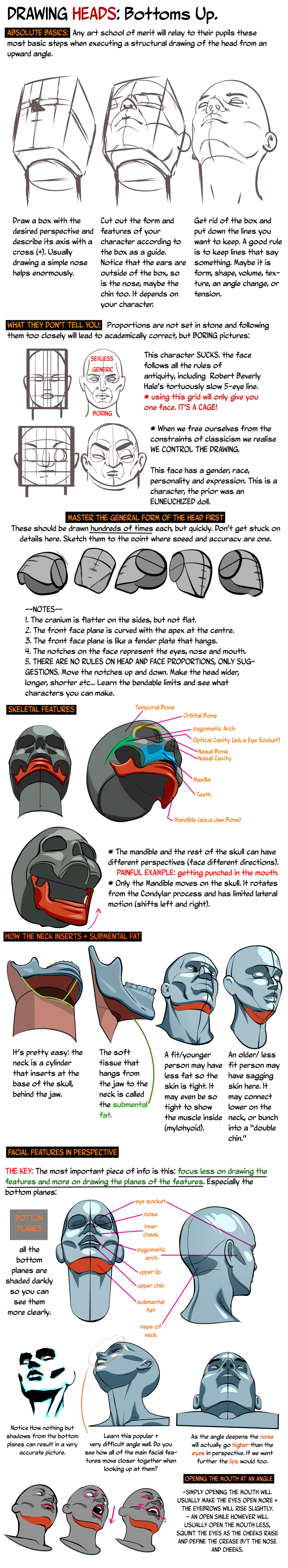
The human body, in all its myriad forms, still follows definite rules of proportion. Wonder why your art looks 'off'? You probably haven't got the proportion right, and your brain is picking up on subtle anomalies. For instance, this image. To correct this impression of wrongness, the creator must study the proportions of the human face.


The same goes for the human body. In many cases throughout 'Green Eyed Sniper', the figures look wrong because their proportions are off.

Anatomy


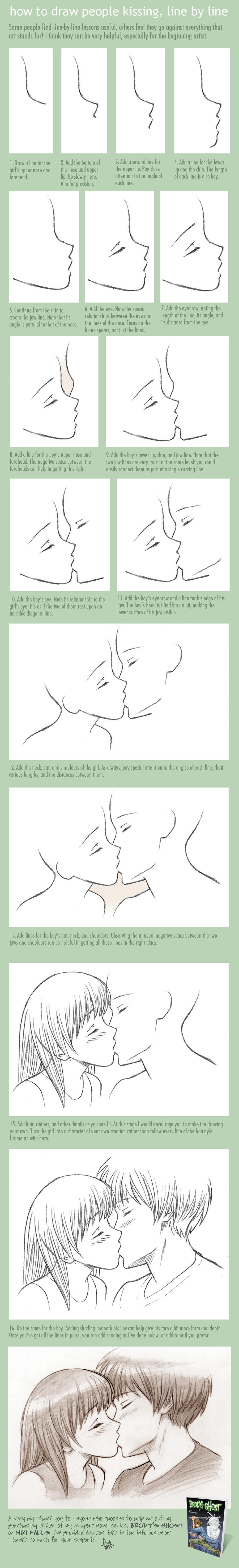
The achillies heel of The Green Eyed Sniper is anatomy. Specifically, STIFFNESS. Even in the most passionate moments, the characters appear as unnaturally posed mannequins. 
 But take heart, this can be rectified by studying anatomy! 
Step 1
The creator should study photo references and anatomy references such as Posemaniacs as they work.


Step 2
Draw figures as matchstick outlines FIRST to get the structure right.
Step 3: Study Angle And Articulation
There are a great many angle and articulation problems that the creator should focus on, especially in the eyes and heads.


These must be improved on before the art lives up to the story


The Revue

There's potential. If this comic creator keeps practicing, they'll hit the target eventually!