Saturday, September 26, 2015

Saturday Revue September 26th: Groovy Kinda

Have I Got Something For You To Look At!

Take A Look At Groovy, Kinda!

Set in the summer of 1996, Groovy Kinda nonetheless has the feel of 1966 in Asheville. It's the messy, mercurial and hilarious intertwined tales of a community of crazy friends all trying to get by as best they can. The creation of Charlie Wise, Groovy Kinda can be found here. 

The Rating


Grab your special brownies and couch lock for a good read.

The Raves

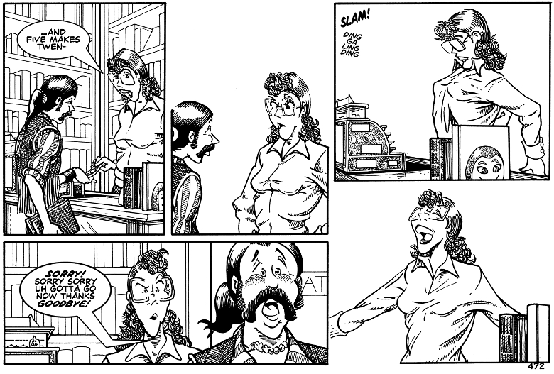
With its wonderful mid-sixties Sunday Funnies look and its ripe sense of humor, there's a lot to love in 'Groovy'. The art style is two parts wonderful nostalgia and two parts great grasp of style, all glued together with skill. Characters are expressive and well-designed, their body language spot on;  even a glance tells you an awful lot about their personalities.  The strip layouts, shading and patterning choices underline the line work wonderfully, encouraging you to relax into the illusion of an old Sunday Funny strip. But don't be fooled. There's no question that this one's for an adult audience; when the story has in its first few pages a neanderthal who's into exhibitionism and the girl next door is a lush, you're in for it.
'Groovy Kinda' is hilariously straightforward about modern life, modern sex, and modern stupidity too. It loves to poke fun at the complicated craziness of relationships in our modern world, with all their little awkward, amusing and HUMILIATING moments. How do you remain a gentleman in the modern era without being a dweeb? Can you stay friends with your sub when you're no longer in that relationship? How do you tactfully figure out if somebody swings your way? These are the kind of questions that are explored to snicker-worthy results.

The Razzes

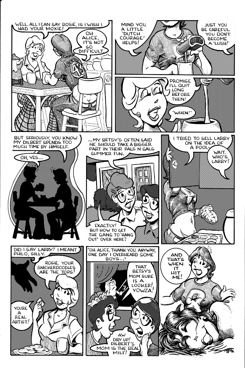
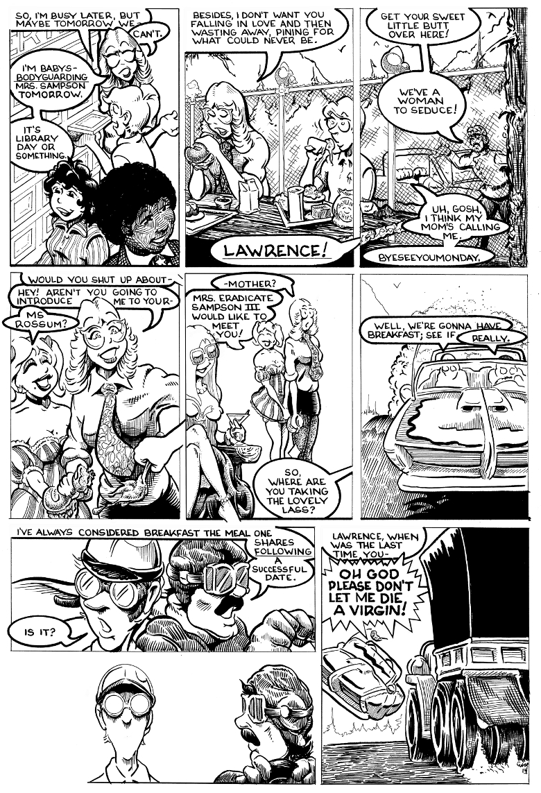
...unfortunately, half the time it's hard to figure out where the story is going, which makes it hard to get a lot of the jokes. The mistake is partly in the storytelling, and partly in the design.
The design problem is easy to see, and easy to fix. To make reading and understanding easier, STOP CRAMMING THE PAGES SO BLEEDING FULL OF SPEECH BUBBLES FLOATING IN DISCONNECTED SPACE! 
*Ahem* excuse me, after reading the entire archive, I just had to get that out. A number of pages are so VERY confusing because the speech bubbles have a horrendous habit of being unattached to a character, or only vaguely pointing to one.  It makes reading heinously difficult on more involved pages.

The story telling issue would take more work, but might be worth it. In essence, it's this: to understand what's going on, the reader must read the cast page. Otherwise, they'll spend a lot of reading time saying 'um...what now?' This is not good. Your story should be a self-contained entity. It should not ask readers to do background research.

The Revue

If you love Baldo, Archie and smart sass, this is your plate of brownies and bottle of vodka. Enjoy!

Saturday, September 19, 2015

Saturday Revue September 19: Zukahnaut

The Aliens! They're Coming!

They're Here For Your Beer!


Some stories begin with a bang. Zukahnaut, the creation of  Ötty Justason & Sonya Somers, begins with a belch.
Life's hard when you're old, fat, crazy and green. But Zukahnaut's working on turning his life around. He's helping the community, hunting monsters and watching out for trans-dimensional portals. On good days he flattens monsters and fights inter-dimensional enemies.
But on bad days....
yeeeahhhhh.....

The Rating

Crude, crazy and crafty, Zukahnaut sure is one of a kind.

The Raves

To begin with, the protagonist is written crass, crazy and creative; in short, perfectly hilarious. The story begins with a fun exploration of insanity, and gets weirder from there. Throughout the story, any weaknesses are covered over by a deliciously cranky humor that pulls no punches at all. Easily offended? Too bad!


The story is reminiscent of vintage Hellboy, back when they didn't care about deep, moving plots and wanted to make their sour and jaded readers grin. There's crazy monsters, there's good old fashioned super-hero story shenanigans, and there's plenty of over the top sour humor to keep things moving. Comic readers will love the occasional self-reflective commentary on making and enjoying commentary too; I know I did.
The irreverence is one of the story's strongest points, keeping it from becoming just another superhero story and keeping we readers interested in something beyond KAPOW! BANG! WHAM! action scenes. (though there's plenty of those!) And under the crass jokes, there's a lot of intelligence hidden in the writing.

The art style and color choices accentuate the vintage pulp impression, well crafted without losing the sense of being printed on sweetly scented cheap paper that leaves ink on your fingers as you read. There's a great sense of expression to character faces, and the character design does a great job of underlining and conveying each personality. I really enjoyed the craft invested in the art and the constant striving to improve the style.

The Razzes

As a reader, my main problem with Zukahnaut was getting into it. Throughout the first chapter, I kept expecting 
to drop down from the rafters. The story had very little direction for the first chapter and a half, and I had to fight to get through page after page of...well, basically, a crass crazy drunk guy. I can go down town to see guys like that. There was also a slight sense of betrayal because, after the first three pages, there was a bait and switch; the intro and first pages made you think that you were going to get into an off the wall exploration of PTSD and war....annnnnd then it went off the rails with portals, drunk jokes and non sequitors, leaving me as a reader saying 'um...what now?' if the creators ever publish, I'd suggest redoing the first half of the first chapter and tightening it up. Don't make readers slog! Irreverence is great, but pointless weirdness, lewdness, disconnected writing and inaccessible characters who don't give you any reason to connect with them isn't. The problems got straightened out fairly fast....but even four confusing or distasteful pages early on is enough to lose you readers.
I also might work on the anatomy and body language of the human characters; while non human characters are wonderfully dynamic, the human characters are stiff-bodied and seem a bit flat.

The Revue

It's rude, it's crude, it's wild, and it's worth a look. Enjoy!

Tuesday, September 15, 2015

Saturday Revue September 12: Jikoshia

Ladies And Gentlemen! Boys And Girls!
Hurry Hurry Hurry!
Behind The Portal Lies...

ADVENTURE!!!

Worlds in peril. Lives on the line. Heroes are called...
whether they want to be or not...heh heh heh. And the hero who said 'not'? That's Nifty. She only meant to prove she wasn't a chicken, but now she's found herself in the center of a battle between powers beyond her comprehension, caught between two worlds, and becoming a figure of legend.
And she still has to get her homework done when she gets home.
Nifty's tale is told in Jikoshia, a wonderful tale by Emily R. Gillis that can be found here.

The Rating

A wonderfully fun and frolicksome tale

The Raves

To begin with, the comic is JUST SO PRETTY! From beautiful site design to lovely artwork, the entire comic is a treat for the eyes. The color palettes employed are used adroitly to emphasize story elements, the painting style practically jumps off the page, and the sense of form and anatomy is spot on. Some really creative things are done when creating a look for magic, and the sound, emotion and movement effects are well done and interesting. The sense of layout and framing to each strip is wonderful to see. Expression and character body language are also skills in this comic's repertoire, great visuals for a story that, while it doesn't do anything you've never seen before, does everything it does with wit, flare and humor. The story jogs along at a great pace; despite the need for a fair amount of explanation, it never falters. The dialogue is sweet, tight and fun, managing to squeeze a great amount of characterization into as few words as possible and doing it in fine form.

The Razzes

My main complaint with Jikoshia is nothing so easy as 'fix hands' or 'get better at faces'. It's simply that, as I read, I didn't see anything I hadn't seen before.Throughout the comic, I found myself thinking 'oh cute, that's just like Avatar.' and 'oh hey, it's just like Tamora Pierce' or 'it's just like...' you get the idea. The comic doesn't do anything badly per se, but it doesn't do...anything. There's no important message, no stunning themes to impart, no innovative take on ideas; it feels as if it's been really skillfully built out of stock tropes. The creator seems on some level to notice this, and even makes fun of it in some clever ways. There's nothing necessarily 'wrong', but I'd love to see somebody as skilled as the creator stretch themselves for a story that could reach beyond the fantasy shelves.


The Revue

A good ol' fantasy adventure story and a good read.

Friday, September 11, 2015

Monthly Matinee September: Using Body Language In Comics

Hurry Hurry Hurry! Curtain's Going Up!
Grab Your Seat For The Matinee!


This Month, See The Amazing Power Of Body Language!


What makes us human?
You could talk about the size of the neocortex of our brains, opposable thumbs, or upright posture. You could talk about bipedal ambulation. But raccoons have thumbs, and emus walk on two legs.
So what makes us human?

 Stories.


From Scott McCloud's seminal
work 'Making Comics'
Humans have done as well as we have because we can conceptualize, articulate and convey complicated multi-step ideas; essentially, the ability to communicate well is what being human is all about. But however good we get at all forms of communication, the oldest one is still there under them all, sending its own messages. It's the language of our  bodies.

Body language gets forgotten pretty often in this era of digital IM and virtual chat rooms. It's easy to forget about the subtle cues the body gives. But sometimes, they are the most powerful messages of all.
In the craft of comics, we get a wonderful gift writers would chew their own pen hands off for: we don't have to figure out how to convince the reader there's body language to our character; we can DRAW IT for them. But sadly, there are plenty of comic creators out there who are holding this wonderful gift in their hands, and haven't even opened the lid.
So let's take that lid off, and explore the power of body language in comic creation.

Saying More Than You Think

The way a body moves tells us a lot about the person before they even open their mouths. Ever had the feeling that somebody was trouble without being able to pin down the reason? You were probably picking up on subtle nonverbal cues conveyed by their body language. Consider these two figures:
From the book 'Designing The Conversation' by Ross Unger, Brad Nunnally, and Dan Willis
Though they're extremely simplistic, each of these figures gives you a strong sense of emotion, because of their stance. As comic creators, we can really use this human instinct to our creative advantage!
Like so much else in comic design, it all starts back at the beginning, with the first few lines you put down on the page. 


Power Lines


The term 'power lines' is used refer to the main thrust of a figure in movement.
Art By Poly-M

 The power line, shown here in red, usually follows the line of the spine. The power line is the backbone of nonverbal communication (pardon the pun) and some of the most basic and primitive of all communication starts here. The wonderful artist Poly-M has provided us with illustrations on this subject. More of her work can be seen here.
The power line may look simple, but it has a wealth of subtle information in it. For instance:
Every situation can be emphasized by thinking about power lines as you draw.
 Take a clip-art argument. Without using power lines, you get this:
There's a little attempt at body language, but most of the work is being done by the facial expressions, and the bodies are static.Too many beginning artists waste the power of the scene by making the facial expressions do all the heavy lifting, when body language should be doing at least half the work! Compare that to an image that uses power lines more effectively:

though this one is drawn more simply, its argument is a lot more powerful, because the power lines of the bodies are intersecting. When body power lines intersect, the scene becomes MUCH more dynamic.
This is true both in conflict,
and in romance
Start by drawing your power lines and get your body language right, and you barely need a face at all!

It's All In The Moves

The basic rule of human body language is this: a closed body is an attempt at defense.
An open body is an attempt to take up space and give the impression of power.
Character on the left is open, with body language that says 'let's talk.'
Character on the right is closed: their body language says 'go away, leave me alone'

  Within the nuances of that fact, you can describe the entire human experience.
The body language of these two images is universal: in the one on the left, he's interested, but every line of her body says 'I want to go away. I don't want to be here.' his arms and legs are spread, trying to take up space and look more impressive. The scene's set: guy trying to take control of conversation, girl's not having it.
Here's another example on the right:
her body language says 'pay attention to me', but his is enclosed, turning away.The dynamic's reversed.


Genital Framing: I'm The Big Man
When someone tucks their
thumbs into their belt loops,
unconsciously framing
their genitals, they're instinctively
saying 'I'm virile, I'm potent, don't
mess with me'
Here's some other common stances:
Hands On Hips: I Assert Myself
This stance is a physical way of
expanding your personal space,
and can be used either positively
or negatively.


Hands Behind Head: I Got ThisSomeone sitting with their hands
behind their head is trying to say
that they've got everything
under control. Often, they're conveying
the subtle message that they're
more important than the person
they're talking to.


To make your characters really visually effective once you've got your power lines down, start thinking about expression. To begin with, don't depend on gimmicks. You don't need sweat beads, lines or nose bleeds if you've drawn your characters with enough detail to the face and expression. to the body. Oh, sure, you can use them as grace notes if you really want to, but DON'T draw an immobile face and a stiff body with a sweat bead and expect that to do the job!

To really make your emotional point, exaggerate your figure a little bit. 

When an action happens all over the body, it has a lot more effect.


Connecting The Dots

Okay! Let's try telling a story with these thoughts in mind. Let's talk to Emo Ed, whose girlfriend just dumped him. Sure, he's sad. But let's really get the reader to FEEL his sadness. 

Show these two images, then show Emo Ed alone in his room with sad music playing, and you've told a full story of a broken heart in three images, with no words. Now THAT is power.

Tips And Tricks

To work on your sense of body language, try these ideas:
*Go to the park, the cafe, wherever and do some life drawing. Drawing from life is the best education!
*Pick up Scot McCloud's wonderful book 'Making Comics', which covers the body language of everything from backs to hands.
*Get a really good book on nonverbal cues: I recommend Joe Navarro's 'What Every Body Is Saying'. They may seem silly and gimmicky, and I wouldn't try to read people in my daily life based on their advice, but for a comic creator their ideas for getting across emotions are amazing.

Other Resources


Monday, September 7, 2015

Sunday Revue September 6th: West

Hang On To Your Fur Hats, Ladies And Gents

We're Going


There are places in every world where humans were never really meant to go. There, only the tough, the brave or the crazy live; the hard headed and the deadly, the heroic and the desperate.
This is one such story. It's the story of a man called Jed, and the secrets of his icy world. And I can't get enough of it.
The creation of Kate Slinger, West can be found on Tumblr  or on Taptastic.
If you mixed Jack London's themes, the stagecraft and silent menace of a Clint Eastwood movie, and the clarity of very cold air, you might, if you were lucky, get West. It's one of the most powerful stories I've read in a while, and for unexpected reasons. 

The Rating

A powerful, stark and evocative story.

The Raves

To explain my love of West, I'll begin by showing my readers this.


In one very short comic, all of the strengths of West are summed up. Wonderful use of expression both in face and body language? Check. Beautiful understanding of line, form, and composition? Check. AMAZING use of light quality? Check. Great use of dialogue? Check.

The dialogue manages to convey an amazing amount of information in quick, compact phrases, and still manage to help power characterization through use of phrasing and word choice. Oh, and did I mention it's amusing too? It is. The little bits of exposition needed for this story are quick, stark, perfectly fitted into the story and to the point. You don't need a lot of words when you're as good as the creator of West.
The plot's simple, but powerful: danger in a dangerous land. And a lot of the storytelling is done through body language and expression. I usually seperate my analysis of a comic into thoughts on the art and thoughts on the storytelling, but you just can't do that here. The story IS the art, the art IS the story. So much of what you need to know is shown not by words, but by the sights the protagonist sees, his body language and the expressions on his face.
The composition and framing is a key character in its own right in this story, and Slinger has NAILED it. I've rarely seen art convey vast, barren expanses so viscerally and so well. You feel as if you should see your breath when you look at some of these pictures. I thought about these things as I perused pages one through twelve...

And then the creator added color on page thirteen. And I fell in love. Yep. Head over heels. Hands down. No question. I was hooked by the beauty, fascinated by the secrets hinted at. And it only gets better.

The Razzes

Funnily enough, I've got nothing to say in terms of improvement about the art, the style or the writing. (well, except AMAAAAAZING, but I said that didn't I?) . What I will suggest to the creator is this: please, please clean up your digital branding. Here's why: I've been waiting to dive into this work for a while. I as a reader had the name 'West' jotted down to look up. So I mosey over to Google and type in West webcomic, right?
And I get....zilch.
After a good amount of hunting around, I managed to unearth a bookmarked link in my computer's metaphorical dusty back cupboard. It took so long because the hosting site isn't called West, and it's not on a central site either.
By the way, there's extra goodies if you go to the Stoneglobe
 Deviantart page! 
 On Tumblr, the body of work's Stoneglobe. 
On Taptastic it's West all right, then on Deviantart it's Stoneglobe again. 
Annnnd on Facebook the creator goes by ScampiCub. 

Here's a suggestion: if you want people to look you up, make yourself easy to look up! Don't make readers scramble and bang their heads trying to remember 'crap what was the OTHER name she goes by?!' It's a good way to lose readers. There is another, analog comic called West and if the creator went with something different to avoid mix ups I as a reader understand....buuuuut choose something and stick with it across platforms. PLEASE.
My only other complaint?
'Waaah I want more and there isn't any more and when do I get another page waaah!'
Ahem. That is all.


Sunday, September 6, 2015

Saturday Revue September 5th: Licensed Heroes!

You Know The Economy's Bad,

When This Is Happening To Heroes!

When even the heroes are in the unemployment office, something's not right! That's what's happening to Tempest, newly licensed hero and the protagonist of  a comic that goes by that very name. The creation of Ben Hsu and Elaine Tipping, Licensed Heroes can be found here. It's an all-too familiar and painfully close-to-home story of hunting for work in a job market that doesn't want your skinny young self!

The Rating

A cute comic, but without enough substance to support its heroic name.

The Raves

Now, don't get me wrong, 'Heroes' definitely made me smile in rueful amusement at the sight of so many job-hunting moments I'd suffered through myself. Every millennial will give at least one pained chuckle of recognition at the jokes in this comic.
 There's some good, solid deadpan humor in here, underlined by the understated art style and Eastern emotional intensifiers.

 Some fun experiments were done with texture and styling as well, and the site design is nice, direct, and simple, with a just plain GORGEOUS thumbnail archive. 

The art style has some definite strengths, especially in composition and framing, and it's got the ability to do some really interesting things....

The Razzes

Unfortunately, there's not a lot more I can say about 'Heroes' that's complementary. Its greatest failing is its writing. Specifically, NOTHING HAPPENS. There are over three hundred pages, and it is, essentially, page after page after page of stuff twenty somethings looking for work go through with a microscopically thin veneer of sword and sorcery. I hate to be cruel, but honestly, it. is. boring.
Nobody wants to read about exactly what they already go through in their own lives ad nauseum. It worked for the first thirty pages, but after that SOMETHING should have HAPPENED.
So maybe I'm a little too judgmental about action, I told myself. Give it a chance, I told myself.
I tried to handle my reaction by looking at the comic as gag-a-day, but that didn't help. Looked at from that direction, 'Heroes' is trying to be Dilbert in armor for millennials, but it's missing the target. The jokes, quite simply, fall flat. A few stand out as great gems, but too many of them are so mundane as to be completely unremarkable, and nothing is done with the writing to draw out amusing elements.  This really isn't helped by the art, which gets more and more simplistic as the comic goes on, as if even the creators are losing interest for the project. When even the creators aren't interested, the project isn't going to do well.

The Revue

A few pages are worth a look, but this isn't a comic worth questing after.