Sunday, January 31, 2016

Sunday Revue January 31: Bubbaworld


And Now To The Stage, A New Act!


Art By JollyJack

A Round Of Applause Please!

Dear Readers, The Strip Show will now have someone new backstage! Jade will be writing our Sunday Revues from henceforth. So without further ado, I give you their opinion of

BubbaWorld!


So, my first time out, and our lovely editor’n’chief has given me a wonderful piece of art called Bubbaworld Comix by artist Andy B.Childress to review. I reviewed the six archives I could find on the website (if there were more, and I like to think that there are, I couldn’t find them in my sleep addled state that evening) I found a charming strip in the classic Sunday Funny style.

The Rating


The Raves


The scripts for Bubbaworld are generally a joy to read, landing on many common tropes that most readers will understand at a glance. I’m hard pressed due to lack of exposure to make any assertion to the overall originality of the jokes, the final presentation in the context of the picture is well thought out. There are a few which I found to be impenetrable, but for the most part, I believe that this strip would be accessible to just about anyone.  

On first impressions, I have to say that I like the clean lines and straightforward jokes very much. While larger story arcs could be seen, the basic premise is to make each comic stand alone and be something that a casual observer might enjoy in passing; context within the overall framework only adds another layer of depth to the punchlines.

The style of art makes no pretense toward any level of realism; it brings to mind something you might see in Sunday Comics page, and is optimized so that the artist can create his characters on model with a high degree of efficiency. The panels are all of a consistent size and every scrap seems to be used to it’s full effect; the composition of the panels is brilliant in this regard. The lettering is done by hand (my compliments); It’s definitely easier to add via an art studio program in post, but the extra effort lends a unity to the finished product that is very difficult to achieve even with the modern software available.


The Razzes


There were, however, a handful of disappointments.  I felt is that the artist’s work appears to have arrived in this world fully formed, which leads me to believe and hope, that there are further archives and other projects to be found containing some early work from which we can learn more of the creator’s style development.
There is a noticeable lack of depth to this webcomic. It falls into the category of a gag a day strip, of roughly the same quality as those you might find in the daily papers. This isn’t necessarily a bad thing, but it's something that is much more tuned to the casual reader than someone that is seeking something more involved. 


While the content is amusing, there is the question of sustainability; strips that have the gag a day structure require a lot of work to keep the content fresh, or readers can become disenchanted. This speaks more to the overall talents of the cartoonist as a writer, and it will be interesting to see how long Andy sticks to this model.


While the website design is functional, I would like to see more of the menu options out in the open, and perhaps a bio on the artist. As mentioned before, the artist’s style seems to have arisen from earlier work, and to a degree I feel robbed of the experience of watching him grow into his craft.


So… On a completely arbitrary five point system:


Art - 3.5


It’s not what I would call incredible, but it is clean and well drawn. It takes many cues from traditional funny pages


Script - 4


The jokes are fun, clean and simple.


Website - 3


Functional, but it lacks in elegance. It feels like it could use a little love to make it into better user experience


The Revue


I’ll be honest; I’m not going to call it a must read, but Bubbaworld Comix is amusing if you have a little time to burn. Without an overarching storyline, this is a good comic to pick up for a quick laugh, but there really isn’t anything to suck you into it or that leaves you begging for the next page.

Saturday, January 30, 2016

Saturday Revue January 30: Shadowbinders

Climb Aboard With 'Shadowbinders'

For Adventure!


Wit. Sass. Strong storytelling. Magic. Oh, and there really are castles in the air. These treats and more await you in the pages of 'Shadowbinders', a tale of colliding worlds and secrets.
The work of Kambrea and Thom Pratt, 'Shadowbinders' can be found here. The tale centers around Mia and a mysterious gift from a bygone era. This gift drags her into a world that is not her own, a world of magic, airships, steam technology and deadly peril aboard the good ship True North, with Captain Crimson Rhen at the helm and trouble on the horizon. All aboard!

The Rating

A well paced and merry voyage, thoroughly enjoyable!

The Raves

I have to say, in this case, it was most definitely the visuals that held my attention from the word go. With a well designed and eminently navigable site acting as the frame for lively artwork, 'Shadowbinders' is a treat for the eyes in a world that takes possibilities to places you don't expect. The art is playful, with friendly colors, amusingly quirky character design and a great sense of fun to balance dark rumors and hints. The characters have a strong dynamic to their movements, and that sense of motion stays strong through pages as well. The sense of action is great in early pages, and only gets better as the artist improves their craft through the course of the story, using interesting angles and a good sense of pose to catch the moment.
That quick, dynamic energy is present in the dialogue as well, and the story moves along at a nice clip with plenty of fun along the well. Snappy dialogue, a nice theatrical note and good foreshadowing keep us interested, and moments of light banter and comic relief keeps we readers laughing. And from the trajectory of the story, I only see it getting better from here.

The Razzes

The only thing that stuck  in my craw as I read was the fact that the story, like its protagonist, isn't quite sure what world it belongs to. Is it an all-ages story? If so, it's awfully heavy on sexual commentary. Is it a saucy adventure? Then why is the main character seventeen? Like Mia, 'Shadowbinders' has a foot in childhood and a foot in adulthood, and that can sometimes be odd.
I'd also like to see the artist do a little more work on profiles. Their art is gorgeous, but often profile shots are flat and not quite well proportioned. To make a perfect profile, remember these ratios

The Revue

You'll want to board this ship, she's going interesting places!

Friday, January 29, 2016

Bacstage Pass January: Pink Pitcher

Come On, Let's Duck Backstage! Here's Our Pass!


We Can Go Meet Pink Pitcher!


Pink Pitcher is the creator of the beautiful and well researched comic


This month, we got the chance to have a chat.

So Pink, tell us a bit about yourself!

I've been making comics since Middle school, but recently engaged in my first long-term project. I live in Denver CO with my lovely fiancee and our two cats.


Main Project 

Root & Branch - http://rootandbranchcomic.com
Tumblr - https://www.tumblr.com/blog/rootandbranchsketchblog

Other Hobbies and Obsessions


I have a degree in Women and Textile History, thus I spend a lot of time on a variety of fiber arts, and have a great interest in Women's issues. I travel whenever I can. I try to spend a lot of time outdoors, hiking, cycling, camping, skiing etc. All of this cuts into my painting time *boo*

So, tell me about your early experience. How did you fall in love with telling stories in pictures?

Back in middle school a good friend looked over at my doodling and said "Hey, you're pretty good at that. We should make a comic together!" We did, we wrote in all the people we liked as good guys, and all the people we hated as bad guys. We read a lot of Witchblade and for a while I drew all my women with tits bigger than their heads. It was a growing experience.

I worked on two main projects from that age until about 24, which meant going back in to re-write and re-draw sections as my skills improved. Thus, I decided that the only way to get a polished finished product is to start a fresh project. That said, I've had this on the back burner for years as well...

What media and programs do you work in to produce your project?

I work with Canson Multi-media paper, Pelikan Watercolors (which I've had for over a decade!), and student (cheap ass) brushes. I use Nichiban tape for my gutters, and gouache and gel pens for highlites. 


I also run a strict diet of Earl Grey and Scones while painting. I consider it part of the artistic process.

Can you tell me about your typical day or strip-creation session? How does your working process flow?

I have been evolving my process as I've learned what works. I used to just make each page one at a time, storyboard as I go, I wouldn't even write dialog before drawing! It's a bit of a nerve wracking way to work, however...
Now I've been storyboarding, at least an entire scene at a time. I will try to do a whole scene at once, up to four pages at a time. I tape gutters, rough in blocking, and pencil all four pages. Then, all four are inked with ball-point pen (High brow art supplies, I know). The painting process then proceeds, each color used on all the pages, flatted then shaded, before moving on to the next color. This helps to keep colors consistent through scenes. Last, before pulling up the tape, I go in with pen and clean up and thicken outlines as needed.

Everything is then scanned and sent to my digital wizard for lettering. That's all black magic to me and I cannot really explain how it's done...


What’s the most difficult part of your work?

Perhaps the most difficult thing is that once it hits the page, it's permanent! The medium doesn't give me as much of a chance to fix mistakes later. I can do some clean up, and abuse the gouache, but ultimately when I make a mark it's not going to be changed and I have to live with that. Fortunately I'm pretty easy going, and it does serve to keep my process from becoming bogged down with perfection.

Can you tell me about your storytelling process? Do you prefer to script your stories, fly by the seat of your pants, or somewhere in between?

I have lots of big story arc ideas mapped out, and even specific scenes scripted far in advance. But, most of the writing is done as I go, keeping just a little ahead of the curve. I like that it allows me to have details evolve and change the more I think about the story, and keeps me from getting too attached to an idea that needs to be cut.


How much of a buffer do you like to keep?

I have a buffer of 26 pages right now, down from 30 when I started the comic. It's a bit absurd, really. Sometimes I'm so involved with what I'm painting now that I forget about the previous scenes and it's hard to answer questions from my Letterer!


Has anyone told you that you'll never be a successful artist and you'd be better off studying a real field and/or getting a real job?

Strangely enough I have always been encouraged. It helps that my mother owned a gallery and bookstore growing up, when one spends all day selling other folks art it's hard to tell your child that you cannot make a living at it! I also recall teachers suggesting that I ditch academia for art or music, but maybe that's because they were sick of grading snarky homework assignments...

On the other hand, I am in a rather blessed living situation, and I do not have to earn a living from art as a full-time endeavour. I have made plenty of money off of art and craft work over the years, but I am not sure I could survive on creativity alone.

What message do you hope readers take away from your work?

I want my work to have a sense of wonder, that the world is a complex and amazing place. I also want to get away from any black and white morality tales, I want readers to sit back and witness a grey-scale of actions and repercussions. I also want them to laugh, just so we don't take ourselves too seriously!

What keeps you devoted to telling the story you’re telling?

I'm too far in to quit!


You can check out Pink's work at these links. Also note, if you like Root And Branch, she's running a kickstarter to get her first volume printed!


http://rootandbranchcomic.com/
www.pinkilicious.etsy.com
www.pink-thatcraftybitch.blogspot.com

Saturday, January 23, 2016

Saturday Revue January 23rd: Hipster Picnic

Bro, Check It!
Braaiiiiinnnnns!

When a comic begins like this, you know it's going to be interesting....
Like that guy who sat doodling in your freshman Philosophy 101 class, 'Hipster Picnic' is a strip-style wanders between humorous gag-a-day material, reflective melancholy,  and off the wall explorations of the id. Focused on two chill dudes and roomates who just happen to be zombies, it's wonderful brain candy...er ahem, pardon the pun. The creation of Patrick Yurick, Hipster Picnic hangs out right here

The Rating

A trip back to your college newspaper funnies, with a twist. Get baked on Sunday morning and give it a read.

The Raves


With its surprisingly endearing blend of bromance and dark humor, political commentary and life, this strip really took me back to the days when I grabbed my college paper while wolfing down a rather unhealthy lunch and pretending I was further ahead on my coursework than I was.  The jokes it makes at the expense of hipster culture, geeky boys with no cleaning skills, life in today's urban environment and the weird feeling that it had fused 'Calvin and Hobbes', 'I am Legend' and 'Bloom County' into a new and stranger whole were a trip. 'Hipster Picnic' is adept at poking fun at the incongruities of vegans who ask for things to taste more like meat (human in this case ;) ) people who think they're changing the world by what they wear, the jackass you share a room with and the weird guy next door. It also had plenty of fun with all the tropes of the zombie genre and dearly loves a good pun. It likes to turn the zombie genre on its head and make at you look at the world as ruled by the Living Dead...who still have to lurch to their day jobs. So much for resting in peace...

 The art style encourages taking 'Hipster Picnic' as a Sunday Funny of the Far Side persuasion, with generally crisp lines, sharp colors and good clean inking that gets the message across without getting overly involved. The comic is really at its best when it uses its wonderfully goofy premise to shine a light on the insane and brainless things we do in our own lives.

The Razzes

But like college kids, Hipster Picnic gets experimental. And that's when things get weird. It has a solid art style and gag-a-day approach, but when it deviates from that it begins to come off as artistically less than its potential. Several artistic forays are made in different directions that might have been best left unplumbed, and it's always nice to see the work come back to what it's good at. The same can be said for the writing style, which sometimes has a hint of too much of that Philosophy 101 class in it, or starts to try to add drama and comes off  a little bit soapy.
The site navigation could also use a tuneup. For instance, take pity on your readers and add a 'previous' button please?
But like a driver with one too many tokes, 'Hipster Picnic' weaves a little but always stays in the lane, and the annoying bumps in the road aren't really a big deal. Besides, the zombies are extra points...

The Revue

Read it Sunday morning in your pajamas, and have something gooey for breakfast. You'll enjoy it.

Friday, January 22, 2016

Monthly Mattinee January: The Art Of Pinning Down Sound

Hurry, Hurry Hurry! Come See The Monthly Matinee!
This Month, The Art Of Pinning Down Sound!

Is This Your Reaction To Comic Lettering?

If it is, don't worry! You're certainly not alone! Lettering is, to many comic creators, an arcane art. It's a vile beast that makes finely wrought art look amateurish. It's an awful process that reduces you to tears on a regular basis, right?
But Wait!
Lettering isn't evil! In fact, it can be your best friend! Lettering is to comics what camera work is to the movies. It is, in effect, the difference between looking like a pro and an amateur. Good art can be ruined by bad lettering, and a early-career  art can come off much more professionally with good lettering.
I'm a sufferer of this myself. In working on the comic Parmeshen, I finally got good enough to realize how bad I was at lettering. So I did a bit of research, and found some tricks and a compendium of resources that will improve your lettering from day one. 
*Note: All works used or quoted in this piece are referenced at the bottom of the page...except the bunnies in top hats.*

Trick Number One: Setting The Stage

When creating a comic, people often think in pictures and add the words in later.
STOP. RIGHT. NOW.
Why?
Because art and lettering in comics can't be treated as separate entities. They're halves of a symbiotic whole, and the lettering should be as carefully and artistically arranged as the imagery to create a beautiful whole.
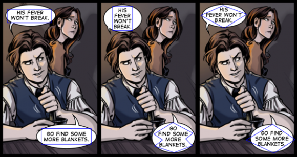
What I'm saying here in overly flowery terms is this: lay out your speech bubbles as you go. And lay them out well. You don't want this:
One of Chris Oatley's examples of WHAT NOT TO DO
I recommend thumbnails as your best weapon against this. Sketch your scenes before you start on final work and save yourself an awful lot of heartache. But for beginners and anxious types like myself, why not take that a step further? Why not lay out the dialogue as one of the first steps in the process of drawing a page?
For example, here are the three stages of layout I use in my own work on the comic Parmeshen. (excuse the character presently residing in the bucket. He's had a bad day.)
Step One: dialogue is laid out over the reference photos I intend to use for the piece. I give the words about twice as much space as I actually intend to leave them as I place them over the images, ensuring that they have the breathing space to be easily legible when the work is finished.The reference photos are then hidden beneath a white layer that I'll draw on, leaving a clean slate and my dialogue laid out where it belongs.

Step Two:the images and figures are drawn AROUND the words, ensuring that neither element gets in the others' way.


Step Three: Art can continue with the assurance that the dialogue is going to fit just fine. This is an especially useful trick on pages thick with dialogue; often I find in Step One that such talkative pages will need more panels than I thought.

 If you really cannot stand to stare at text as you work, try creating a separate text layer or sheet of onion skin paper for those carrying on the proud tradition of hand lettering, lay the verbage out and hide that layer, referencing it when you need to be sure your spacing is what it needs to be to fit both your witty banter and your art.

Trick Number Two: Changing Shape

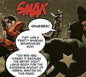
Now that we've talked a bit about space around the word balloon, let's talk about space inside the balloon.  Most of a letterer's mistakes happen right there, and they include
Another great example of what NOT to do, from Comictools.com
To avoid these mishaps, remember the Flawless Diamond. Try to lay your words out in a diamond shape. Chris Oatley is, again, the perfect example of this. Take a look:
A nervous scene from the lovely comic 'Les Normaux'
As Oatley writes, " The first two panels have a lot of wasted space within the word balloon because the text is not broken into a shape that fits naturally within the balloon. The third panel successfully implements the football formation."
Oatley also reminds us to leave the text room to breathe. Text should, unless there's a stylistic reason for it, NEVER EVER touch the bubble wall! In fact, the bubble ought to have a clear space between the text and the wall at every point. This lets the reader's eye avoid confusion or the feeling that the words have been an afterthought.
That's not to say that clever things can't be done with style in thought and speech bubbles. For instance, you can give the feeling of someone who's anxiously talking and thinking by one long, run-on sentence bubble. Bubbles can overlap one another to show that one speaker has interrupted another. There's no end to what you can do, and a great discussion of all that style can be found on Blambot. But first and foremost, make it LEGIBLE. If readers have trouble reading what you're saying, you've already lost them. Also, think about your fonts veeeerry carefully. A scary dripping-blood font is fine, even great for a sound effect, but don't make it part of the dialogue. Here's an example from an otherwise beautiful comic that I adore, Root And Branch:
The art is stunning, but the font makes the reader squint! Don't do this. Dialogue fonts should be clear, legible, and easy to scan. They can be cool, but they're worse than useless if they're hard to read. In life and art, style needs to take shotgun and sense needs to drive.

Trick Number Three: Deceive The Eye, Cast The Story Spell


So now that you've placed your art and imagery perfectly in your panel, you have to do the next panel. And that opens up a whole new box of trouble.
Many creators make mistakes in dialogue and panel flow when they're beginning (I definitely count myself in this category) and it immediately separates the creative beginners and the pros. To pitch your creative work a little closer to the 'pro' camp than the 'amateur', here's something to remember: the point is to trick the human eye into reading, in lines and text, the impression of movement and the passage of time. Here are some tricks to create that illusion.

Right To Left. Left To Right. Up To Down. No Exceptions!

In the West, we're trained to read left to right. In the East, it's right to left. Either is fine. But stick. With. ONE! If you're writing for a Western audience, they'll expect to see dialogue flow in a specific way. If you confuse their eyes, chances are they'll grow annoyed and give up reading your work. It can be a subtle mistake, like this:
Getting a sense that something's wrong? That's because you're being forced as a reader to read by context who's said what instead of relaxing into a familiar pattern of 'what is on the left is first'. This is really disconcerting for a reader! Your dialogue shouldn't confuse the eye, and neither should your layout.  The layout should flow naturally from panel to panel, not forcing the eye to hunt for the next moment. 


 It's much better to keep the eye moving seamlessly from image to image, keeping up the illusion of movement. Forcing your readers' eyes to falter and your readers' minds to work to follow the story flow breaks the spell you're trying to weave around them. You can encourage this impression by the direction the characters are moving, looking, pointing ect. but the main pressure is on the dialogue to move in a clear and seamless pattern. Keep the lettering and layout of your dialogue readable, logical and easy to follow, and you're half way to great comic art!
See? Lettering isn't so bad after all!

A Little Bag Of Tricks

Below is a short list, in order of usefulness,  of lettering and general layout tips and tricks. Articles marked with asterisks were referenced in this blog and thoroughly enjoyed.

Comic Book Grammar & Tradition by Nate Piekos An absolute Aladdin's cave of style, grammar and aesthetic traditions of comic making. I WISH I'd had this on hand as a baby creator, it would have helped my style so much!

*Comic Layout Tutorial: The Comic Lettering Spell Chris Oatley writes in clear, insightful and eminently usable terms about good and bad layout and lettering. He's an inspiration!

*  Comic Layout Tutorial: Comic Balloons & Clarity Another great and witty Oatley article that's a must read

Wikipedia Glossary Of Comics Terminology Gutters? Tiers? Encapsulation? Your guide next time you get to talking layout with the pros.

*Balloon Shape From Comic Tools a great read on just how shape affects readability

Comic Composition, Layout And Flow a solid discussion with good visuals of laying out a readable and dynamic comic.
*Medli20's A Note On Comic Layout a great collection of image-heavy tutorials on layout via Deviantart

A Tip Of The Hat

Thanks to Knightjj of Les Normaux and Pink of Root And Branch for letting me use their work as examples, both works deserve a read! And if you'd like to take a look at my own artistic stumbles, wander over to Parmeshen


Saturday, January 16, 2016

Saturday Revue January 16th: Root And Branch

And Now For Your Viewing Pleasure!

The Beautiful 'Root And Branch'!

To begin reading 'Root And Branch', take your classic sword and sorcery tale. Turn it inside out. Now look at it from the other direction. Look at it through the outsider's eyes. That's what 'Root And Branch' asks you to do. It asks you to look at the world through the eyes of the elves.
'Root And Branch' is a gentle and well paced tale of cultural interaction, politicking, environmental stewardship and diplomacy masquerading as a fantasy, and it is beautiful. The tale is told here, and is the creation of Pink Pitcher. It is the tale of Ariana, a Greenwalker (humans call them elves) who left home on a great journey, and finds that both she and the humans she meets along the way have an awful lot to learn.

The Rating


A beautiful message conveyed in a beautiful package. This is one I want on my bookshelf.

The Raves

If you've read much Sword and Sorcery, you know that it's not always all that well thought through. Everybody speaks the same language for some reason, for instance, and nobody ever tells you how these big medieval cities deal with the sewer systems...because apparently that's too boring. Root and Branch spoke to my inner history buff by exploring all the issues lesser fantasies skip. There's explorations of how difficult it is to cross a language barrier for instance, and the mistrust and mutual disrespect that almost unconsciously creep in when neither party can understand what the other's trying to say.  There's discussion of what happens when you aren't careful about your sanitation in a new settlement situation, and what happens when you cut down all the trees that were providing soil stability. There are cultural differences: often hilarious...sometimes painful. And all of it's shown with wit, charm, and so much gentle good humor that you don't realize you're actually learning things. Add to that good, solid research of period clothing, attitudes, and even songs, and you've got fantasy at its finest.
The art has the soft, lively watercolor approach of book illustrations, reminiscent of the styles of 'The Rabbi's Cat', 'Aya: Life In Yop City' and some of my favorite children's stories. This work shares with the ones I've named a deceptive simplicity that is underpinned by great skill, especially in posing and expression. 
The color scheme of the story accentuates the message; the world of humans is brown and grey, a sick world. The world of the forest is vibrantly green. But the storytelling, though it sometimes harks back to Fern Gulley, never beats you over the head with anybody's message. It simply tells you, in no-nonsense terms, that this is what happens when you don't pay attention to the life of the world around you. The art does the real talking.

The Razzes

I got to say it, I love 'Root And Branch.' But I don't always love the font choices. The human speech is, in particular, a bit tricky to read sometimes. And as a fellow comic creator, I'll say the thing all comic creators realize about ten minutes after we finish drawing the page to the lovely creator: you might want to double check where you put your speech bubbles on pages, sometimes they get a little jumbled. Right-left, top-bottom is the rule. And while you're in post-production, I might hit the 'sharpen' button once in a while, some pages have a very slightly blurred quality about the lines that, at a guess, I'd say comes of a scanner misbehaving. But if I'm picking at nits like these, it's because I don't have anything else to pick  and as a reviewer, I have to find something!

The Revue

Read. It. And as a side note, if you love 'Root And Branch' as much as I did, it's got a kickstarter for its first print run going right now. Give it a look right here.


Sunday, January 10, 2016

Sunday Revue Jan. 10: White Angel

Ladies And Gentlemen!

Boys and Girls!

Are You Ready To Be Amazed?

From The Halls Of Myth And Fancy, Behold!


Angels and Demons. Darkness and Light. And one hell of a wild ride.
The comic 'White Angel' opens on another battle as old as Time, the battle between the forces of good and evil. It's a gripping entry into a world where Angels aren't fluffy and Demons aren't Halloween costumes. They're real. They're fighting. And one of them just fell out of the sky and dented the hood of Ryan's car.
 Now he's stuck with a wounded Angel on his hands, a little sister to babysit, and a test on Friday. It's going to be a long week....
Created by Ting Chen, 'White Angel' can be found here.

The Rating

A tale mythic in scope and moving in vignette. Think City of Angels, with swordplay.

The Raves

From the word go, 'White Angel' has a crisp, clean storytelling style meshed with equally sharp art. In action sequences, the art style is beautifully dynamic, with a powerful grasp of anatomy and posture crossed with a great flare for the dramatic.

But there's plenty of anime series out there that do nice fight scenes. White Angel's strength is in its poetic use of plot and character dynamics when the fighting's done.
In a style reminiscent of good Japanese independent films,  'White Angel' captures the nebulous power of a moment, a glance, the tone of a voice. Which, you have to say, is quite the accomplishment for a silent media!
Like a well told folk tale, moments from this series seem to hang in the air and in the mind some time after they've passed, their impact much deeper than the simple words in which they were couched. This is pulled off with a strong blend of good dialogue, spartanly elegant plot and a good eye for layout and panels that accentuate the importance of events. Combine clear, sharp storylines that are intriguing and yet somehow mythically clean and uncomplicated, good art and interesting characters, and you've got a great story. Color me impressed!


The Razzes

I don't have a lot to complain of in 'White Angel', but I do have a gentle warning that it's easy for stillness in art to become stiffness. There were some points in the art when unmoving sitting or standing characters seemed static, almost manequinnish in their poses, which is in stark contrast to the gorgeous sense of movement in the action scenes. Fix that one little issue and you've got top notch art Ting Chen!

The Revue

Poetry in comic motion, and certainly one to keep an eye on!