Heads Up! Hold On To Your Hats Ladies And Gents!
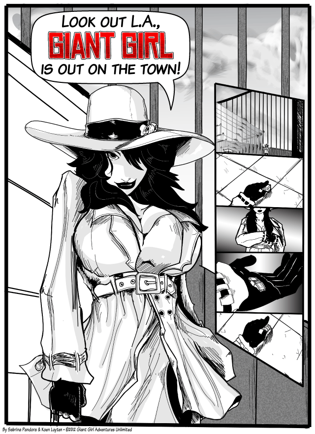
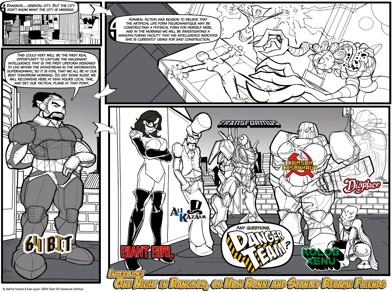
We all know, love, and hate tropes. But not many people both embrace and spoof them as whole-heartedly as Giant Girl Adventures. A hilarious romp through all that is best (and worst) of the Hollywood Pulp world, Giant Gir's got it all.
The creation of Sabrina Pandora and Koen Luyten, Giant Girl Adventures can be found here
The girl in this weekend's comic, Ronni, is all class...well, when she isn't all sass. Cross Indiana Jones with Laura Croft and throw in a dash of MIB and you got Ronni. And Ronni gets in trouble...lots of it. Add in the self-styled awesome gay sidekick and some pretty hilarious super powers, and you've got endless possibilities for trope-infested fun.
The Rating
There will be MIB agents, fifty foot women, monsters, and attacking skulls. Strap in and hold on!
The Raves
First off, any strip that manages to squeeze in as much cultural commentary as Giant Girl does, while still having fun, gets an A in my book. The humor in this comic is the snide, sidelong sort that points out the plot holes and logical fallacies in the Hollywood we love (or love to hate). Running the gambit from spy movies to action heroes, Giant Girl spoofs them all.
As a woman, I particularly appreciate the jabs made at what women superheroes are wearing these days, and some truly soda-snorted-out-the-nose jokes are made at the expense of what Hollywood thinks girls should look like. Not to mention the jokes about how superheros scrounge up travel money and snarky comments on flashbacks.
Oh, and in there there's also a story, did I mention? Ronni had been doing just fine as a stunt double, retired from the hero life, until a cosmic McGuffin drops in her lap. Then it's off to Easter Island to piss off the Maoi, around to Paris, Bangkok, and anywhere else that catches her fancy. But the characters, despite the constant ridiculous situations, maintain an amusing banter. And the story manages to walk the fine line between being jam-packed with jokes, and being overloaded. And the jokes really are ENDLESS, and pretty endlessly diverting.
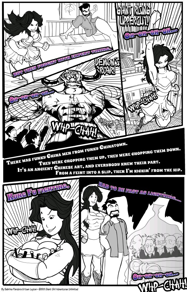
The art's snazzy, dynamic and fun, not quite true to the Golden Age style but close enough to get the mood across without feeling like a knockoff. Interesting angles and poses are used to keep the feel of the story fresh, and the use of action effects, east and west-style emotional amplifiers and nicely done text for sound effects really enlivens the pages, keeping up that sense of constant action-movie motion without becoming distracting.
Oh, and I almost forgot....the strips makes nods to classic rock songs.
They win.
The Razzes
The greatest weakness of this strip is, probably, its layout. When viewed, the comics appear almost unreasonably small. Click on them and the comic nicely enlarges...but that means readers have to click on nearly every comic, and are forced to remember, with regular do'h moments, that you cannot click on the strip in order to go forward. When there's thirteen issues, each comprising a baker's dozen in strips, it gets really, REALLY irritating. You'd be amazed how annoying it becomes by issue 6. Add to that the fact that, around the nav buttons, are several linked banners that will take you places you entirely didn't want to go on the site, and it becomes something of a trial.
Other than that, I've no complaints. Yes, it's ridiculous. In the best possible way.
Other than that, I've no complaints. Yes, it's ridiculous. In the best possible way.
The Revue
The perfect antidote to Hollywood. Case closed.


No comments :
Post a Comment
Drop us a line!