Hang On To Your Hats!
Here Comes
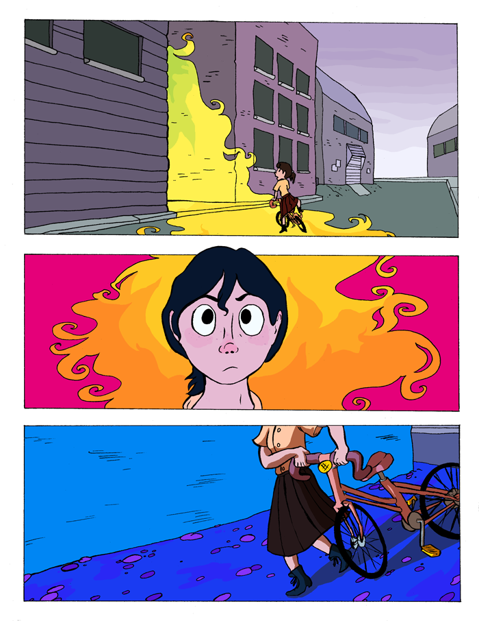
Sometimes, the world can hand you unexpected things. Character lies in what you decide to do with them. And what Daisy decides to do is fight back. That's when things start getting interesting...
This adventurous dive into color and chaos is the creation of
Natalie Riess, residing at this link
It's the unexpected journey of Daisy, whose drab life is suddenly and unexpectedly flooded with color, adventure, and DANGER. After this, nothing will ever be the same.
The Revue
Beautiful and feisty!
The Raves
To begin with,
THE
COLORS!!!!!!!
THE
COLORS!!!!!!!
Color is the main theme when you're discussing Snarlbear.
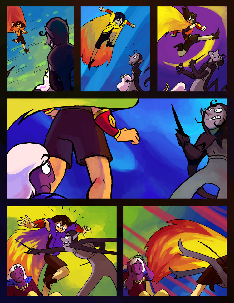
Bright, breathing, Skittles-has-nothing-on-this-rainbow kind of colors. Amazing colors.
These rainbow washes jump off the page, dance behind your eyes and bring the story to life. The characters and their moods are defined by color, and the world around them is beautifully enlivened in all its deadly glory. Oh, by the way, it is deadly. Everything around here wants to eat, cheat or maul you; you were warned.
In story 'Snarlbear' has a taste of 'The Phantom Tollbooth' and 'the Dark Crystal' about it. (along with just a hint of D&D) There's plenty of questing for the sake of questing and killing monsters because you're getting paid to, but there's also a solid core of valor and friendship woven through the storyline that keeps it true.
In story 'Snarlbear' has a taste of 'The Phantom Tollbooth' and 'the Dark Crystal' about it. (along with just a hint of D&D) There's plenty of questing for the sake of questing and killing monsters because you're getting paid to, but there's also a solid core of valor and friendship woven through the storyline that keeps it true.
This world runs on emotion and symbolism; leave the logic at home and let the magic ride. if you can do that, it's a great adventure. The characters are given their personalities through well-portrayed actions and scenes, and there's a good grasp of body language and poise to underline dialogue. Between the COLORS and the good grasp of characterization, emotions come across with stunning clarity in this work. I fell in love with Daisy's fierceness and Flint's tricksome charm. I also fell in love with the site design on this comic; as we webcomickers know, a good website is the frame for a good comic, and a bad frame can degrade the whole piece. Well Snarlbear nailed it with solid and sweet designs that are both efficient and charming!
The Razzes
Two things hold Snarlbear back from being a 10 star A+; anatomy and consistency. Style is one thing, but I'd really like to see some more work on anatomy and jointing when drawing living things. Limbs aren't straight; they have bends and curves. That needs a little more attention in some pages of Snarlbear. In fact, inattention seems to be the creator's one great weakness; you can tell when they've had a rough time; the text becomes too small to read, the scenes grow stilted and the creator's usual skill falters. This was most prevalent in Chapter 6 and the work pulled itself back up to scratch afterwards, but it was a noticeable lurch in what is otherwise a really great piece. I hope not to see another such slip as the work goes forward. It's always sad to see a creator with solid skills slip backwards or get sloppy.
The Revue
Dive in head first and be swept along by a tale of wit, valor and magic!


No comments :
Post a Comment
Drop us a line!