Working on getting varied skin tones right? Mary Winkler can help!
Re-blogged from https://design.tutsplus.com/articles/a-quick-lesson-on-using-different-skin-tones-in-portrait-illustration--vector-9075
Here's a quick theory lesson on choosing skin tones, shadows, blush colors, and adding to warm or cool palettes. A great jumping board for figurative pieces and creating your own skin palettes. Skin tones are often a challenge for some, but with a little insight into a variety of palettes, you'll find it a lot easier than you think.
Let's Start With an Ambiguous Base
Let's start with a fresh face. I chose some features that are a bit ambiguous in terms of ethnicity. For a real piece, more than just skin tone. would be changed from person to person.

Skin Tones for the Lighter Skinned
Starting with light/Caucasian skin, I've chosen a peach color with a yellow-orange undertone. It's light, but not really pink.

The shadows for this tone are darker with a more orange tint.

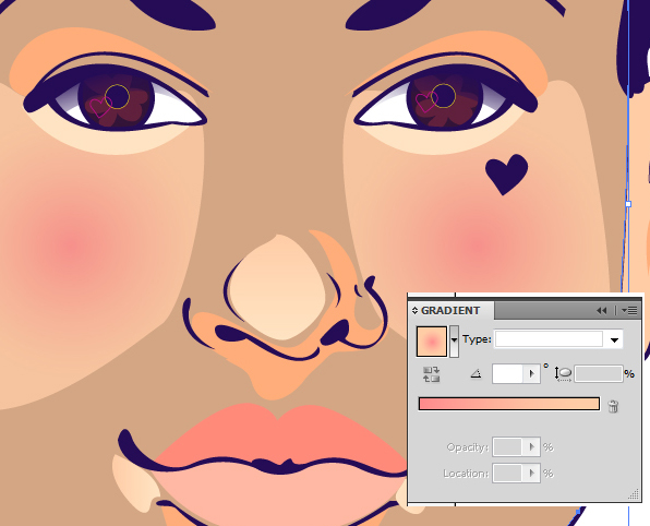
For blush tones, I went for an orange/pink. Think of sunsets and watermelon in terms of this hue.

An optional step is to make the top lip a pink or red tone instead of the shadow tone.

The bottom lip was set as a light pink instead of the main skin color.

All of the tones in this set are orange based. For highlights check out this light orange-pink hue.

I've set it as a gradient going from the highlight color at 100% to the same color at 0% Opacity.

Skin Tones for Olive Tinted Complexions
Moving on to a darker skin tone. This one is a bit more olive. It's a cooler tone.

I play with two different shadow colors for this tone. One is cooler than the other. You can mix a cool undertone with a warm shadow tone to make your person a bit more real. The shadow tones may also depend on your overall color scheme. The pink used for the blush is more of an orange-mauve.

The tone I chose for highlights on this olive-toned skin is a light tan. To subdue it, I've applied it as a gradient going from the highlight to the base skin color.

Here's the warmer shadow color I mentioned. It's like a pink-tan. The color on the lower lip is just a lighter version of it.


Skin Tones With a Peach Base
Next up is a peach skin tone. Unlike the other light skin color, this one stresses pink more than orange. The HEX number for this color is #F2B9A5.

The shadow for this one keeps true to the pink-red tone of the base color. It's a very warm tone. Changing it to something cooler alters the entire look of the skin color. The HEX number is #DC7F6E.

For the highlights, try a light, creamy version of the base peach.

The blush tone is very, very pink in comparison to the ones used before.

Skin Tones for Warm Cocoa Complexions
Let's warm things up with a light cocoa color. There's a lot of shades similar to this tone, so feel free to explore.

The shadow color is a neutral tone. You can make the choice to warm it up by pulling the green arrow to the left (if you want is darker) or the red arrow to the right (if you want it lighter). To cool it down, pull the blue arrow to the right and adjust. Too much blue will make the shadows look unnatural or like something blue is reflecting on your figure.

The highlight color is a creamy, peachy tan. Something whiter or more yellow would throw off the warmth of the skin tone.

The blush tone is a very dark rose.

Skin Tones With a Dark Cool Palette
The last skin tone. I'm covering this time is a variation on a very dark brown. I'm skewing this to a cool palette so it goes along with the dark purple I chose for the line work.

The shadow color is a bit cooler than the base tone. It's got a very blue undertone to it. You can choose something more red, brown, or purple, but it would alter the entire palette.

The highlight color is a warm, buttery beige. It will be subdued in the same manner the other highlights were (by applying a gradient to the shape and altering the opacity).

Some notes on how changing tones can alter the appearance of the colors around it. The blush tone shown here is cool. It comes off as a purple against the chosen skin tone.

The blush color chosen here is much, much warmer. It glows against the skin color. Notice how this blush color compliments the highlights better than the purple blush above.

Conclusion
The breakdown of skin tones above are just a starting point for creating realistic portraits and figurative pieces. Trying out different ethnicities in your portrait work will help you learn further variations and give you more insight into the contrasts of the skin. Until next time, happy creating!


No comments :
Post a Comment
Drop us a line!