
And Now For Something EPIC
Preeeeseeeenting Epic Land!
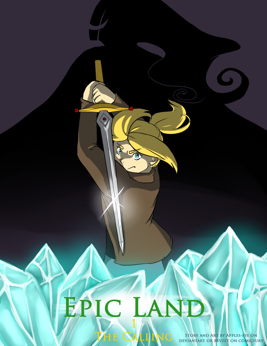
Worlds at stake and Chaos loose. A young girl caught in a destiny she'd never imagined. So begins the adventure of Epic Land. And it does a good job of living up to its name.
This sweet little piece, written and drawn by an artist by the pen name of Revzet, can be found at this link.
At the center of this story is Moe, a school girl with a real streak of cynicism and a good dollop of guts. She's nobody's fool, and messing with her probably isn't a good idea if you want to keep your teeth where they are. She's definitely feisty, but she wasn't expecting ancient prophecies that tell her she's to be a hero.
Moe's world is just coming out of a series of terrible wars, and there's a constant anxiety about diplomacy breaking down and the wars beginning again. Moe has seen a bit too much of that, and it's jaded her. But more's going on than she knows, and very quickly she's drawn into deadly intrigues that have very, very deep roots.
The Rating

Not bad, not bad at all!
The Raves
Epic land begins with quite an ambitious plot line, and for the most part it makes it work through interpersonal scenes and exposition panels laying out the backstory.
The pacing is well done; consistently action-packed and yet expansive enough to allow for several viewpoints and a good bit of backstory.
The pacing is well done; consistently action-packed and yet expansive enough to allow for several viewpoints and a good bit of backstory.
The art's whimsical, hand-laid look is reminiscent of staples like Pepper-Ann, Hey Arnold and Doug, and manages some of the same feeling of adolescent adventure and charm despite the subject matter being somewhat darker than what's explored in those pieces.
 There's a lot of promise in the direction the art is going; with great shading, good clean color palettes and a steadily improving sense of pose, anatomy and facial expressions, Epic Land is one to keep an eye on. There's also a really good grasp of dramatic mechanisms and when to use them to add a sense of energy to the story.


The Razzes
There's a lot of promise to Epic Land, but it's definitely still got some things to work on. I'd like to see a little more attention paid to anatomy and form, especially of unusual objects. At this point in the art, I can tell exactly when the artist is drawing something they're familiar with and when they're not, and that's not a good thing. Take the bird in the panel below, for example.
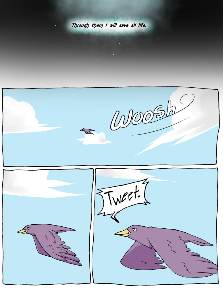
The color and shading is great, but the line work is pretty clumsy on this birdy. Now, simplistic is fine, it works well with the style, but a figure can be drawn in a simplistic style and still look polished. It might help to google up a few reference photos when working on something unfamiliar, whether it be an expression, a stance or an object that hasn't been experimented with before. Even better, go to the park and try doing some life drawing; it's great practice to make you really see the world and note all its details.
There are also occasional moments of clumsiness in the storytelling, mostly stemming from a slight overload of detail without a solid backing. The story starts out strong with a prophecy, but five minutes later there's a fight scene going on between alien characters, and suddenly we're thrust out of fantasy and into sci-fi. At another point in the story, we're thrust between scenes, leaving the reader thinking 'um....wait, where are we now?' I quite like each disparate piece of storytelling, but more work needs to be put into making them feel cohesive. Right now we as readers keep getting handed puzzle pieces that we're expected to find places for, and that can be a little off-putting. So can some of the explicit narration that's used in word boxes. There was some good utilization, but often it was totally unnecessary and broke the flow of imagery. That wasn't helped by some of the word choices used in said narration, which got pretty clunky. I was glad when the artist dropped it from the flow for the most part.
My last thought is something of a nitpick, but some of the font choices also didn't sit well in this piece. The style is loose and impressionistic, and yet a very Times New Roman font is used whenever The Voice Of Prophecy is heard or explicit narration is done. Denoting the gravitas of those scenes is great, but I'd recommend a font that doesn't seem so terribly out of place with the rest of the style.
In a nutshell, I'd like to see the story become more tightly focused and cohesive, and it looks like it's headed in that direction, which I was glad to see. As long as the creator remembers that we as readers are completely new to their world and can easily get lost, they'll do fine.
The Revue
Keep on plugging at it Epic Land, you're getting better with every strip!
No comments :
Post a Comment
Drop us a line!