
Hungry for some zombie comedy action? Then sink your teeth
into…

The Rating

This comic has some good jokes and a unique approach to
zombie fiction, but it has a lot of flaws to overcome.
The Raves
Fans of zombie fiction know that blood, gore, and violence
are staples of the genre. You just can’t have zombies without those things…or
can you?
What immediately stands out about Bite Madness is that it’s
really not all that big on the splatter. Not to say there’s no violence at all
or that it doesn’t get messy
on occasion, but it’s not what Sir
Hellsir focuses on. Instead, comedy and the quirky cast take center stage
here. The characters are simple enough; you have X and Y, a duo roaming the
apocalyptic cityscape in search of, well, zombies. Y is an energetic, fearless
marauder, while X is more the voice of reason. The two meet up with a nutty,
overly enthusiastic robot named Pi-Omega who was built by the mad scientist
Epsilon. Epsilon has seen…er, better days, but don't worry, he’s been patched up.

Sort of.
And jokes like that are part of what makes the comic
enjoyable to read. It has loads of self-awareness and manages to crack some pretty smart jokes about the
kinds of things you’ll see in most zombie invasion stories. Combined with a fun
cast, if most of them lacking a little bit in depth, it’s still got potential.
It has the trappings of a zombie story – society falling apart, scattered
people banding together, and action – but it stands out by focusing less on the
gore and more on the actual story.
If you come to zombie stories looking for a splatterfest,
you won’t find it here, but if you want something that takes a different, more
comedic and self-aware approach, this is the comic for you. And don’t worry,
even though the comic isn’t all that graphic, there’s still plenty of excitement
and zombies to blast.

…but first, let's make sure our fortifications stay sound.
The Razzes
The art is certainly not the strong point here, with
somewhat boring backgrounds and color choices. Most pages look very grey and
white, and it makes the whole image look washed out. The use of texture is
nice, and gives the page some grit, but it doesn’t make up for the lethargic palette
or the fact that most of the backgrounds look flat. For example, the forest here looks scribbled-on and featureless.

But with some more detail, even imprecise, sketchy detail, those trees could look more distinct, have more depth, and even look denser:
 |
| Notice also the grass texture and lights on the skyscrapers to make it more obvious they're buildings. The smallest extra effort can go a long way. |
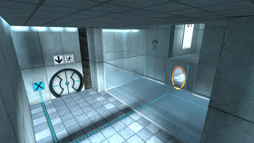
Obviously, these are just suggestions and not commands. What you see above you was just one approach to making the background on this page more interesting, and make no mistake, backgrounds matter in a story like this. In a post-apocalyptic setting, readers expect to see damage and chaos. The environment is a big part of driving home the feeling of danger and catastrophe. Without that, the audience is merely being told that society has collapsed, instead of seeing it before their very eyes. Instead of ruined cities, the characters look more like they’re running around in a Portal test chamber. Of course being well-written is the most important thing in a comic, and your writing has a lot to like about it, but the art could do a much better job of supporting the writing.
Inconsistent dynamics are also a problem here. The characters look too stiff most of the time. There isn’t a lot of energy to their movements, with one exception. Pi-Omega has some of the best poses and angles in the comic. Just compare how he looks to how X looks on the very same page:
 |
| In the post-apocalyptic future, our glorious robot overlords will be more flexible than the meatbags. |
Sir Hellsir, I don’t know if you realize this, but you
already understand something important about poses and dynamics that you’re not
applying to your human characters. Namely, that it’s all about using shapes and
lines of action to build the form. Because Pi-Omega is so sectioned, you seem
to have a really strong grasp on how to build his form using the shapes his
respective parts, and what comes out of it are some darn good shots. If you
apply those principles to how you draw humans, you’ll get results. You’ve already
got the skill to do it! Just break the human character down into parts and try
to use the same approach you’re using with Pi-Omega. You’ll get the hang of it
soon enough.
Aside from all that, the comic also suffers from typos and
bad grammar. In fact, it seems to actually get worse as the comic goes on. I’m
not sure why that is, but it bears considering. Try to spend a little more time
double-checking the writing for mistakes.
 |
| Bad grammar makes dialog awkward to read. In this case, awkward on a few different levels. |
The Revue
I have to admire this comic for taking the zombie apocalypse
setting and focusing more on the cast and the comedy, rather than yet another
viscera-encrusted romp. Despite its flaws, this comic could be something unique
and fun to read. It has its own kind of brilliance already, and with some
improvement, that brilliance will get some real crunch to it.
No comments :
Post a Comment
Drop us a line!