Black holes. Hyper-evolved technology. Asteroids destroying your yard.
An Algebra test at 9 in the morning to top it off.
Brace yourselves, you are now entering the Robo Hole. Jump in with your guide, the creator Trusty Shamrock.
The Rating
The Raves
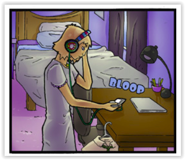
A wonderfully sharp and snarky tone keeps this classic 'alien in my back yard' storyline moving at a good clip, the wheels liberally greased in sarcasm. This clever and quirky tale takes the idea of E.T. in a far less saccharine direction, replacing adorable grade school characters with jaded middle grade kids and all that comes with it: the angst, the arguments, the snide comments and the wit. The color palette matches the slightly sour mood of all early teenagers as they navigate the rocky road to adulthood, with some very interesting cybernetic twists and alien-induced surprises along the way. Like Stranger Things? Add a fourteen year old sister who's not amused and you've got Parsnip, our main female protagonist.
There's a good sense of world building in this story, and the character design is consistently witty and distinctive. As the story continues, the learning curve on the art really shows, and the backgrounds on the newest pages are especially gorgeous. I've been more and more impressed by the creator's grasp of texture and lighting in the natural world. The scene building is both well done and witty.
The Razzes
Now that we've talked about how lovely the static scenes are, let's talk about human form and movement. It needs a little work. When standing still Parsnip and her gang look pretty good
But when there's motion, things start to get a little stiff. There's some serious work to be done in foreshortening and in facial structure. Let's begin with facial structure in profile and at an angle. The human face IS HARD, mainly because we're programmed to read tiny differences in human faces and therefore any minor issue in the face makes our brains go 'wait...no no no not good'. This is a hellish bane to artists. But there's specific things that can be done to improve. DragoArtdoes a wonderful full tutorial on the subject of the human face, but the basics are shown in a single image:
Another good point to remember is:
Basically, the face is not flat. Unfortunately the creator has a tendency to draw it as if it is, which results in this uncomfortably wrong look.
I reccomend keeping a copy of a really reliable artist's diagram for the human face and referencing it regularly until the problem is solved. Here's a good one from an old art book.
Another good resource is "Headshots" by Christine Welman a.k.a Errant Crow • Blog/Website (www.errantcrow.deviantart.com)
Now, for the movement problem. There are very few straight lines in the human body, so drawing a figure with straight lines isn't going to help the human eye. Take this piece for example. Without the s-curve to the spine, the body seems stiff and unreal. I recommend trying the Line Of Action method to improve fluidity.
Here's some ideas (MC's note: I got these a few years ago from a friend, if you know the artist feel free to comment with credit dear readers.)
The Revue
Grab your tunes, turn up the volume and sit down on Saturday morning with your cheerios and Robo Hole. Give yourself a treat.
Hungry for some zombie comedy action? Then sink your teeth
into…
The Rating
This comic has some good jokes and a unique approach to
zombie fiction, but it has a lot of flaws to overcome.
The Raves
Fans of zombie fiction know that blood, gore, and violence
are staples of the genre. You just can’t have zombies without those things…or
can you?
What immediately stands out about Bite Madness is that it’s
really not all that big on the splatter. Not to say there’s no violence at all
or that it doesn’t get messy
on occasion, but it’s not what Sir
Hellsir focuses on. Instead, comedy and the quirky cast take center stage
here. The characters are simple enough; you have X and Y, a duo roaming the
apocalyptic cityscape in search of, well, zombies. Y is an energetic, fearless
marauder, while X is more the voice of reason. The two meet up with a nutty,
overly enthusiastic robot named Pi-Omega who was built by the mad scientist
Epsilon. Epsilon has seen…er, better days, but don't worry, he’s been patched up.
Sort of.
And jokes like that are part of what makes the comic
enjoyable to read. It has loads of self-awareness and manages to crack some pretty smart jokes about the
kinds of things you’ll see in most zombie invasion stories. Combined with a fun
cast, if most of them lacking a little bit in depth, it’s still got potential.
It has the trappings of a zombie story – society falling apart, scattered
people banding together, and action – but it stands out by focusing less on the
gore and more on the actual story.
If you come to zombie stories looking for a splatterfest,
you won’t find it here, but if you want something that takes a different, more
comedic and self-aware approach, this is the comic for you. And don’t worry,
even though the comic isn’t all that graphic, there’s still plenty of excitement
and zombies to blast.
…but first, let's make sure our fortifications stay sound.
The Razzes
The art is certainly not the strong point here, with
somewhat boring backgrounds and color choices. Most pages look very grey and
white, and it makes the whole image look washed out. The use of texture is
nice, and gives the page some grit, but it doesn’t make up for the lethargic palette
or the fact that most of the backgrounds look flat. For example, the forest here looks scribbled-on and featureless.
But with some more detail, even imprecise, sketchy detail, those trees could look more distinct, have more depth, and even look denser:
Notice also the grass texture and lights on the skyscrapers to make it more obvious they're buildings. The smallest extra effort can go a long way.
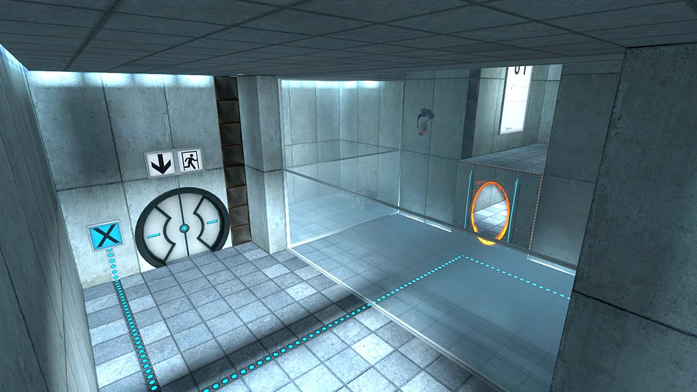
Obviously, these are just suggestions and not commands. What you see above you was just one approach to making the background on this page more interesting, and make no mistake, backgrounds matter in a story like this. In a post-apocalyptic setting, readers expect to see damage and chaos. The environment is a big part of driving home the feeling of danger and catastrophe. Without that, the audience is merely being told that society has collapsed, instead of seeing it before their very eyes. Instead of ruined cities, the characters look more like they’re
running around in a Portal
test chamber. Of course being well-written is the most important thing in a comic, and your writing has a lot to like about it, but the art could do a much better job of supporting the writing.
Inconsistent dynamics are also a problem here. The
characters look too stiff most of the time. There isn’t a lot of energy to
their movements, with one exception. Pi-Omega has some of the best poses and
angles in the comic. Just compare how he looks to how X looks on thevery same page:
In the post-apocalyptic future, our glorious robot overlords will be more flexible than the meatbags.
Sir Hellsir, I don’t know if you realize this, but you
already understand something important about poses and dynamics that you’re not
applying to your human characters. Namely, that it’s all about using shapes and
lines of action to build the form. Because Pi-Omega is so sectioned, you seem
to have a really strong grasp on how to build his form using the shapes his
respective parts, and what comes out of it are some darn good shots. If you
apply those principles to how you draw humans, you’ll get results. You’ve already
got the skill to do it! Just break the human character down into parts and try
to use the same approach you’re using with Pi-Omega. You’ll get the hang of it
soon enough.
Aside from all that, the comic also suffers from typos and
bad grammar. In fact, it seems to actually get worse as the comic goes on. I’m
not sure why that is, but it bears considering. Try to spend a little more time
double-checking the writing for mistakes.
Bad grammar makes dialog awkward to read. In this case, awkward on a few different levels.
The Revue
I have to admire this comic for taking the zombie apocalypse
setting and focusing more on the cast and the comedy, rather than yet another
viscera-encrusted romp. Despite its flaws, this comic could be something unique
and fun to read. It has its own kind of brilliance already, and with some
improvement, that brilliance will get some real crunch to it.
Imagine Avatar re-written in an intelligent, soul searching manner. Imagine Tarzan with a brain. That, dear readers, is Hominids. Created by Jordan Kotzebue, this is the adventure tale you always wanted and never got. All the adventure, all the beauty, all the raw living power of the jungle is here, but this time there's a heart and mind to match. This story will steal your heart and entrance your eyes. Prepare yourself for a trek into a tale.
The Rating
A True Tale Spinning Feat.
The Raves
This rave must begin with the art. Gods, the ART! Lush, rich, vibrant and viridian, the artwork of Hominids is stunning. The creator is truly a master of their craft, capturing body language, expression, lighting and atmosphere with a breathtakingly deft hand. The color of a flower, the light on a leaf, the gleam on a blade all draw the reader eyes-first into a living breathing ecosystem. You can almost smell the loam and leaves, breathe the humid fragrances of strange flowers and sweat and feel the grass between your toes. This art is exemplary.
But beautiful artwork is only the first strand of the web. Onto the storytelling, which is more than a match for the art!
Hominids is aptly named, for it is, in effect, a story about people: their loves, their hopes, their dreams, their motivations, and what circumstances and culture can make them into. Angel or monster, heathen or heretic or high priest, it has nothing to do with who you are and everything to do with who your culture THINKS you are. The best people can be twisted into beasts by a culture with a domineering mentality. And the angriest people can be eased by a culture that focuses on peace and cooperation. Hominids is a parable about interacting cultures on one level: what has in other places been called 'the dance of the givers and the takers' is portrayed here. Cultural interaction between cultures with entirely different priorities can very quickly get problematic.
On a creative level, you can't help but be impressed by the creative worldbuilding and scientific dedication that went into this work. For instance, the ecosystem is based on and in some cases drawn directly from anthropological research on what various branches of the human family tree might have been like, and exploring a time when we coexisted is FASCINATING. The subtle attention to plant and animal species appropriate to the setting really impressed me (being a horticulturist in my professional life, people who get plants right make me happy!) and there are many deft and subtle bits of ecological and evolutionary design: for instance, the tree dwellers are perfectly designed for their forest home. They even have dappled patterns on their skin that aids them in concealment. THAT impressed me. This creator did their homework!
On another level, this is a story about the interaction between individuals and the moral code of their culture. In Hominids, people ask eternal questions: do I believe what I was taught? Was I brought up with the right beliefs? What if there's another way? As the characters ask themselves, we're all encouraged to ask these questions along with them, and we all grow stronger for it.
But wait, there are still more layers! There is a spicing of sci-fi hidden under the fantasy of this tale, a hint of an older and far more technological civilization hidden under the vines and creepers, metal under the jungle loam. Now what happened here, the reader must ask. What indeed...
But that hint will remain, for now, just a hint. This vibrant ecosystem of story works holistically: none of these elements jar or push out the others. It's part of what makes such a complex story work.
Another key element is extremely strong writing. The dialogue is crisp, clean and believable, the story moves along at a perfect pace, and there's just the right amount of pleasant, sweet and amusing banter mixed in to keep the story upbeat in the face of deep, difficult and complex themes.
In a true master stroke, every single character is well-rounded, strong and believable in their motivations: serious homework having been done is evident again in the careful use of psychological motivators, but this story reads as a STORY, not as a text book, and that's what takes it from good to great. You can understand and sympathize with every single character, even the ones you despise. And that is true greatness in storytelling.
The Razzes
There's not a lot to be said against this comic: it's stunning. But a few little areas could use some polishing up.
First off, dearest creator, when you've made something as AMAZING as this it doesn't deserve the rookie mistake of missing a page favicon. I'd add one as soon as possible. As a reader I noticed this little detail when, flipping through the tabs on my taskbar, I couldn't find the one for Hominids at first. Because it had a blank favicon that looks like any other neglected waif of a page. Let's fix that!
Simply put this code into the header of your site's HTML:
and replace 'example' with the url where you store your image. Done and dusted. Your icon should be 160 by 160 and say something about your page....for Hominids, might I suggest a leaf? The only other thing I might suggest is a little work on tangent lines and dialogue layout. Occasionally the reader's eye is confused about the direction of speech in a conversation. The creator has color coded the speech, which helps enormously, but careful attention to word bubble placement is still essential.
Always remember that English readers read up to down, left to right. Throw that off even a little and you have confused eyeballs.
The Revue
A wonderous and enchanting MUST READ. Fern Gulley for adults, Avatar for intellectuals. Enjoy!
Four kids, faced with an onslaught of invading forces, take
up arms to save their country and loved ones…
The Rating
This comic has nothing about it that stands out as
its best feature. Every aspect of its quality is poor and has seen no meaningful improvement in 17 chapters.
The Raves
Judging by the comments, Simon Nero does have a
dedicated fan or two. But I don’t see anything here that I can
recommend as a major selling point. Instead, I will attempt to summarize the story for curious
onlookers.
The main character, Simon, witnesses a horde of robots (Or
maybe just people in armor? It’s hard to tell.) attack his home and kill his
mother. While his father fights the robots off, his friend, Diana, rescues him
by using a crystal that somehow teleports them far away from the attack.
Meanwhile, Kendrick, a man who fights with a power called Dark Armor, saves a
girl named Rin from the attack, escaping as the invaders round up their
captives onto a slave ship. They meet up with his brother, Xavier (who has the same
Dark Armor powers), and Levy, a scientist. Diana meanwhile tells Simon her
personal backstory, which…really doesn’t make sense, given that he was there to
witness said backstory. It really just serves to drive home that she used to not have friends and also that she has a crush on Simon.
Eventually, the separate groups converge in the city of
Octavius, far from the scene of the invasion, and Levy proceeds to beat Simon
up for not being able to protect his mother. Diana (understandably) is enraged
and attacks Levy, which gets her knocked out for her efforts. Somehow, this
leads to Levy and Kendrick deciding to train these kids to go to battle, and
the kids agree to this. Unfortunately, before they can proceed, they have to deal with Xavier's powers turning him into an unstable, bloodthirsty monster. This intricate problem is solved by punching him in the face.
A three-year time skip ensues and the kids reunite (the boys
and girls are separated during training to, in the comic’s own words, “prevent
distraction”). What follows is two and a half chapters of nothing but the
characters sparring. And for some reason, suddenly now the boys and girls are allowed to
spar together because
…whatever.
The city is attacked and the characters boldly go into
battle. It turns out the attack was launched by Hale, Simon’s older brother,
and at this point, I couldn’t even tell you if this character had appeared in
the comic before or not. Let’s just assume this was supposed to be a plot
twist. Either way, the fight ends with Kendrick dying and the characters making
a tactical retreat and staying with Simon’s aunt and uncle. While making new
plans, the group learns that Levy and her experiments are the secret behind
Kendrick and Xavier’s powers, and Hale was apparently an experiment gone terribly
wrong. And that’s where I’m going to stop the summary.
There is a prequel, which you can also find on Tapasticor on the series blog. I won't be reviewing that today, but if you enjoy this story, you will most likely want to read the prequel, which covers more ground on the characters and setting.
I guess
if I had to choose anything at all about the comic that stands out, it would be the
Dark Armor. It’s interesting that it has a tendency to turn an otherwise
ordinary person into a violent berserker. That’s hardly an original concept, but it’s not a bad
one.
Now, the wonderful thing about webcomics is the high accessibility.
Anyone can make a webcomic. There’s no minimum standard, and I strongly believe
that should continue to be the case. Shutting the door even slightly undermines
one of the biggest merits of the medium as a whole, its unfiltered,
unrestricted freedom to be creative and to express creativity. So, slowmostevo,
if creating this webcomic makes you happy, by all means don’t take this
admittedly bleak review as an indication that you should stop. But if you want
to attract more of an audience, you’re going to have to do better than this.
The Razzes
Simon Nero is in need of massive improvements in just about every
aspect except for the website, since
the comic is hosted on Tapastic. A somewhat plain-looking site with an irksome
archival system, but it’s still functional and simple to use. The fact that the
comic is at least accessible is the
reason I gave it a 1 instead of a 0; whatever I might think of the comic, I’ve
still seen webcomics of a similar (lack of) quality with far worse choices in
platform.
The Eight Deadly Words
“I don't care what happens to these people.”
This is about the worst thing you can ever get as feedback.
See, in a character-driven story, which I am assuming this comic is meant to
be, having a cast the audience doesn’t care about means the audience won’t care
about the story, either. How do you make people care about what happens to your
characters? Well, for one thing, you need to make them sympathize with the
characters.
You might be thinking that means the reader needs to feel
sorry for them. And you’d be wrong. Sympathy isn’t derived from seeing trauma
after trauma piled onto a character. Sympathy comes from being able to relate
to the characters. They need to act and think like a real person would. And for that, you need to learn about character development.
Character Development
Let’s start with a simple exercise. Look at these 100
Character Questions and see how many of them you can answer. The first step to writing a good character is understanding who
they are. The next step is understanding motivation. What drives your character
is as vital to the story as any plot device you throw at them. The problem is,
some of your characters have shallow motivations. The girls, for example, seem
to get easily distracted by romance in situations where a character really
shouldn’t be thinking about that. These are people in life or death situations!
You need to make them take it more seriously.
You also have some characters who are extremely unlikable. Being boring is one thing, but being outright detestable, especially for a non-villain character, is a big problem. Levy is the biggest offender of them all. Having her beat up two teenagers is not a good way to endear an adult character to the audience. It doesn’t make her seem “serious” or “stern”, it makes her seem cruel and abusive.
On the other hand, you have Simon, who seems driven by his desire to protect his country, and also his guilt at failing to protect anyone. That's honestly not a bad starting point, but these personality traits only seem to come into play when the plot decides it's important for him to feel guilty. Otherwise, he shows little personality beyond being blandly nice. There's not much progression on how he deals with his trauma, nor does he seem to have a goal beyond the vague "save my country." But why does he want to save his country? Why does he care about saving his family? What attachments does he have? How did he feel about them? What personal goals and desires did he have that were forced aside when his home was attacked? Ultimately, we don't know much about who he is, just what he does. And what he does is run away, train, battle, run away...later, rinse, repeat. It's time to start exploring why these events matter to him and what the stakes are.
Pacing and Plot
Pacing is another major problem with the writing. You have
this tendency to rush through conflicts without properly developing them. For
example, Xavier's Dark Armor-included bloodlust being resolved by simply punching him is what we call a deus ex
machina. You can’t just throw in cheap fixes like that. Conflict in a story is good, but not if the resolution is contrived or anticlimactic. Furthermore, it seems that Xavier's Dark Armor going out of control only happens when it's convenient. He doesn't go into a frenzy during sparring, battle, or any other event that would likely trigger it. It makes the potential threat of his Dark Armor seem insubstantial and the singular event where it does go out of control look like rushed filler.
A lot of the comic seems like filler, in fact. Like a lot of shounen manga, you draw out fight scenes
for a long time, but many of the fights seem to accomplish nothing. The sparring matches are the biggest
offenders, seemingly intended to show how the characters have grown, but not really demonstrating any growth other than them apparently being better at fighting. The fight scenes might be more enjoyable if the art was better, but
the visuals aren’t exciting enough to make the action fun to read. Instead, it
just becomes a big empty hole in the story where nothing happens. Besides, action for the sake of action doesn't work well even when it does look good. Without a purpose that brings about story progress, it's nothing but pointless violence.
Here's another exercise for you: can you answer the journalistic questions as they apply to the plot? These questions are tied closely with the 100 Character Questions from before. The events of your story are mainly instigated by character actions, so it's important that you understand your cast and be able to answer who and what made things happen, and why, when, where, and how. These are simple, exceedingly direct questions, but being able to answer them is vital.
Sequential Art Essentials
The art needs massive improvement. I’m going to hit on what
I see as the most vital aspects you should work to improve on and offer you
some good, solid resources you can learn from. To get you started, I suggest
reading Understanding
Comicsby Scott McCloud. It’s one of the best primers on sequential art out there.
I also recommend you take some
art classes. Start with something basic like beginner drawing, or a figure
drawing class that provides live models. The best way to learn how to draw well
is to learn how to draw something as it is, and not as you imagine it. Cartoon
art isn’t meant to look exactly like real life, but having a good foundation in
practicing still life and model drawings is an essential foundation for any
aspiring artist.
Composition
This is an all-important principal to any medium of art.
Composition is defined as the way an image is arranged, such that the eye
travels the picture. Perhaps you’ve heard of the golden spiral, also known as
the golden ratio. It looks like this:
Notice how this asymmetrical shape grows in size at an
exponential rate. This shape is naturally pleasing to the human eye and we tend
to follow its movement from the inside-out. This pattern appears quite
frequently in nature.
It's also common in art. Not every example of this spiral pattern is as clear-cut as what you see here,
but the point I’m making is that good composition has a central point that
immediately draws the eye, and the rest of the image follows a roughly circular
motion around the image. The golden spiral is merely a mathematical concept to
explain why certain compositions are more pleasing to look at. Now let’s
compare these images I showed you to a random section of your comic.
Ah. You see now how unbalanced this is? In the first panel,
you have a character cut in half by a panel. In the next, you have her dangling
out by her leg. In the third, there’s a huge empty space that makes the shot
look bottom-heavy. The fourth panel is probably the best-composed, but it would
have looked even better as a bust shot, bringing her further up the panel. In
all of these shots, the eye is stuck in one spot. There’s no background, no
interesting angles, it’s just one singular piece of the panel occupied by a
character surrounded by empty space. I’m not saying every last panel needs to
follow the golden ratio, but it’s a good starting principle to give more
consideration to how you compose these shots.
If you want to read more about this concept, check out this article
on emptyeasle.com. The site has a lot of useful tutorial besides this one.
Aside from that, there are also serious problems with the composition in terms of understanding what the characters are doing. In comics, composition also refers to the readability of the action, and your readability is confusing. Even stick figures can be composed in such a way that it's easy to understand what's happening. In fact, we see xkcd do that on a regular basis. The trick is to clearly show where everything is in relation to everything else. The panels have this sense of detachment. Action doesn't clearly flow from one shot to the next. Which brings me to my next point...
Gestures
If you’re going to insist on drawing action scenes, then you must understand gesture. For starters, watch this video.
Notice how there’s an emphasis on curves. Your art is stiff
and angular, but the human body tends toward round, squishy shapes. You need to
loosen up your line work a lot. Just look at how static this shot is.
Improving your anatomy would be a welcome change, but if you
practice gestures, you’ll find yourself naturally getting better at anatomy in the
process. Trust me, your action scenes will improve by leaps and bounds if you
take the time to practice gestures on a regular basis. But lest you think I'm suggesting you need realism to make something dynamic, remember, even stick figures can be effective at conveying movement.
I cannot stress this enough. If you want to draw action, learn to draw gestures.
Lettering
This is one part writing and one part visuals. First of all,
your writing is full of typos and grammar mistakes. You badly need to either
spend more time editing, or get somebody to beta read for you. The only thing I
like about the lettering is the rough texture of the sound effects. It looks jarring and loud, which is exactly how it should look.
The dialog font you’re using for the later portions of the comic is also good, but you
need to work on the shapes of the word bubbles. You seem to be stuck on either circles or…whatever
this is.
The text size also varies without rhyme or reason. You
should try to stick with a standard size indicating regular volume.
A change in font size normally indicates a change in
volume, but that’s not happening in this scene. Pick a standard size that’s
easy to read and stick with it. Don’t change it just so you can fit it all
inside the bubble. Make the bubble fit the text and don’t make the text larger
or smaller unless you’re trying to convey that somebody is shouting or
whispering.
But mostly, please work on those typos and maybe take a
writing class to learn how to write dialog better, because nothing about the
way the characters talk sounds remotely natural. I could go on about other specific
ways the art and writing don’t deliver, but working on these things before all
else will help put you on the track to improvement.
The Revue
We all have to start somewhere, and most of us start at the
bottom. It’s going to take a lot of practice and dedication to improve this
comic, but if this is really something you love to do, then it’s worth it to
try a little harder.


 A wonderfully sharp and snarky tone keeps this classic 'alien in my back yard' storyline moving at a good clip, the wheels liberally greased in sarcasm. This clever and quirky tale takes the idea of E.T. in a far less saccharine direction, replacing adorable grade school characters with jaded middle grade kids and all that comes with it: the angst, the arguments, the snide comments and the wit. The color palette matches the slightly sour mood of all early teenagers as they navigate the rocky road to adulthood, with some very interesting cybernetic twists and alien-induced surprises along the way. Like Stranger Things? Add a fourteen year old sister who's not amused and you've got Parsnip, our main female protagonist.
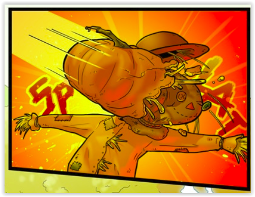
 There's a good sense of world building in this story, and the character design is consistently witty and distinctive. As the story continues, the learning curve on the art really shows, and the backgrounds on the newest pages are especially gorgeous. I've been more and more impressed by the creator's grasp of texture and lighting in the natural world. The scene building is both well done and witty.
 Now that we've talked about how lovely the static scenes are, let's talk about human form and movement. It needs a little work. When standing still Parsnip and her gang look pretty good
 Let's begin with facial structure in profile and at an angle. The human face IS HARD, mainly because we're programmed to read tiny differences in human faces and therefore any minor issue in the face makes our brains go 'wait...no no no not good'. This is a hellish bane to artists. But there's specific things that can be done to improve.