
Brace Yourselves!

Your Life Is Being INVADED By

Black holes. Hyper-evolved technology. Asteroids destroying your yard.
An Algebra test at 9 in the morning to top it off.
Brace yourselves, you are now entering the Robo Hole. Jump in with your guide, the creator Trusty Shamrock.
The Rating

The Raves
 A wonderfully sharp and snarky tone keeps this classic 'alien in my back yard' storyline moving at a good clip, the wheels liberally greased in sarcasm. This clever and quirky tale takes the idea of E.T. in a far less saccharine direction, replacing adorable grade school characters with jaded middle grade kids and all that comes with it: the angst, the arguments, the snide comments and the wit. The color palette matches the slightly sour mood of all early teenagers as they navigate the rocky road to adulthood, with some very interesting cybernetic twists and alien-induced surprises along the way. Like Stranger Things? Add a fourteen year old sister who's not amused and you've got Parsnip, our main female protagonist.
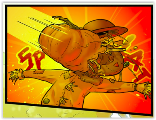
 There's a good sense of world building in this story, and the character design is consistently witty and distinctive. As the story continues, the learning curve on the art really shows, and the backgrounds on the newest pages are especially gorgeous. I've been more and more impressed by the creator's grasp of texture and lighting in the natural world. The scene building is both well done and witty.
The Razzes
 Now that we've talked about how lovely the static scenes are, let's talk about human form and movement. It needs a little work. When standing still Parsnip and her gang look pretty good
 Let's begin with facial structure in profile and at an angle. The human face IS HARD, mainly because we're programmed to read tiny differences in human faces and therefore any minor issue in the face makes our brains go 'wait...no no no not good'. This is a hellish bane to artists. But there's specific things that can be done to improve.
DragoArt does a wonderful full tutorial on the subject of the human face, but the basics are shown in a single image:


Another good point to remember is:

Basically, the face is not flat. Unfortunately the creator has a tendency to draw it as if it is, which results in this uncomfortably wrong look.

I reccomend keeping a copy of a really reliable artist's diagram for the human face and referencing it regularly until the problem is solved. Here's a good one from an old art book.

Another good resource is "Headshots" by Christine Welman a.k.a Errant Crow • Blog/Website (www.errantcrow.deviantart.com)


The Revue
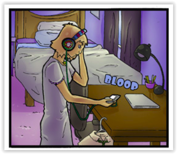
Grab your tunes, turn up the volume and sit down on Saturday morning with your cheerios and Robo Hole. Give yourself a treat.

No comments :
Post a Comment
Drop us a line!