Get Something In Your Crosshairs Today With
Love. Hate. Betrayal. Guns. Those three words practically sum up Infected Blood's 'The Green Eyed Sniper'. It's the story of two women's love and one woman's hate for herself, the story of a sharpshooter with a target she'd rather miss. It can be found here and mirrored here on Taptastic.
The Rating
Aim a little better next time, you missed the bullseye
The Raves
You can never go too wrong with love and bullets, right? The great strength of this story is in its dialogue and characterization.
Romance? Check. Snark? Check. Writing style? Check.
Romance? Check. Snark? Check. Writing style? Check.
The romantic and emotional tensions between Sekhmet and Shanti create some powerful writing moments and truly memorable imagery, as well as some very sweet scenes. Add that to Sekhmet's internal tensions and her external conflicts with her profession, and things get INTERESTING.
Speaking of interesting, a good minimalist noir style is just beginning to develop here, and it may well go places.
Speaking of interesting, a good minimalist noir style is just beginning to develop here, and it may well go places.
The Razzes
.....The emphasis is 'may'. And if so, it's got a long way to go.
The focus in this work is on character and the art supports that by narrowing in on the characters to an exclusion of background. Stylistically, that's great.....if the artist's skill can support it. Infected has a bit of work before they're at that point. Here's a few guideposts on the road.
Proportions
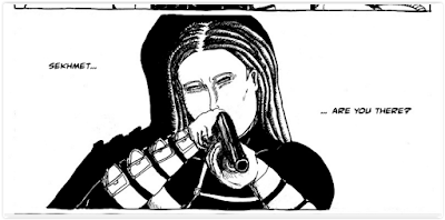
 The human body, in all its myriad forms, still follows definite rules of proportion. Wonder why your art looks 'off'? You probably haven't got the proportion right, and your brain is picking up on subtle anomalies. For instance, this image. To correct this impression of wrongness, the creator must study the proportions of the human face.
The same goes for the human body. In many cases throughout 'Green Eyed Sniper', the figures look wrong because their proportions are off.

Anatomy
 The achillies heel of The Green Eyed Sniper is anatomy. Specifically, STIFFNESS. Even in the most passionate moments, the characters appear as unnaturally posed mannequins.
But take heart, this can be rectified by studying anatomy!
Step 1
Step 2
Draw figures as matchstick outlines FIRST to get the structure right.
Step 3: Study Angle And Articulation
There are a great many angle and articulation problems that the creator should focus on, especially in the eyes and heads.
These must be improved on before the art lives up to the story
The Revue
There's potential. If this comic creator keeps practicing, they'll hit the target eventually!


Thanks a lot for the review and your great suggestions, Otter Kit! I'm well aware that I need to practice more, and I will.
ReplyDeleteP.S.: I was just wondering - who is Karma? :)
Oh dear, sorry! This is what happens when I mix up words I associate as I write. It's been edited, thanks for pointing that out!
DeleteCool :)
Delete