Saturday, July 30, 2016

Saturday Revue July 30: Kila Ilo

Fire Up Those Engines!
It's Time To Fly With


Kila Ilo, the creation of  Cassie Thomas, is an offbeat jaunt through science fiction. Imagine Lilo and Stitch written for adults, and throw in a little Torchwood for good measure. Then remove all the human protagonists and replace them with truly inhuman characters. Now you're getting the picture.
Kila Ilo, the titular character, is not somebody you want to mess with. She's on the wanted list of quite a few planets and her past is...shall we say patchy? She is, after all, The Patchwork Queen. Oh, and she can and will bite. She's none too happy about ending up on a dead end contract to hunt up an ancient weapon on a dead end planet called Earth, but she's going to have to make the best of it.

The Rating

The ship's got a few dings, but she's spaceworthy all right!

The Raves

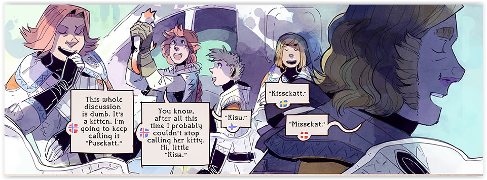
'Kila Ilo' has all the elements of a good sci-fi; a terrible ancient weapon, a motley crew of aliens, a doggedly determined law enforcement agent and a protagonist with enough skeletons in her closet to supply a Halloween fun fair. But for a snarky-sweet romp through sci-fi look no further!
I've been waiting to review Kila Ilo for some time, and it definitely met my expectations. There's a good sense of pacing to this work, with jokes at all the right moments and dialogue that keeps things moving along at a good clip. There's a dry wittiness to the work that keeps things endlessly charming and infuses old sci-fi cliches with new life. The creator's taken full advantage of their chance to comment on the absurdities of the human condition by giving inhuman characters the chance to comment on it, with delightful results.
But it's not all fun and games. A surprisingly introspective thread weaves through the snark and the silliness; in Kila Ilo the creator has explored the depths and complex meanings of friendship, loyalty, loneliness and the marks our past leaves on our personalities.

At its best, the art is stylistically interesting and eye catching, a nice stylistic balance between 90's cartoon and watercolor-inspired charm.


The vibrant color palette brings the world to life, and the slightly green tinge to the color scheme keeps strong the flavor of the odd and the otherworldly. At its best, the art is beautiful, especially in the case of singular vignettes with white backgrounds used for title pages. These pieces shine.

The Razzes

Unfortunately, the art doesn't always hit its best level. It tends to show when the creator is enjoying a piece, and when they're not, or when they've gotten out of their depth on a scene. When that happens, the art falls flat. Literally.


Despite attempts at shading, the creator often seems to forget-or grow lax on- issues of perspective and shading. The result is less than impressive compared to other areas of the comic. If the work was consistently hitting its high points, it'd be an automatic ten in my book, but pages like this example 


drag the rest of the work down. I'd love to see the creator focus a little more on their perspective and contour shading and focus on creating a truly well rounded art style. Contour shading isn't easy, that's true. But remembering where shadows fall and putting them in proper place is what gives reality to a world.
I think the creator of Kila Ilo would to well to make a serious study of the way light and shadow falls on objects. Improving their shading in general will vastly improve the overall work. If I were the creator, I'd try studying something like this photographer's guide to lighting.


 Even going back to the basics could be a good exercise. Remember 'draw shapes' and 'shade the egg' exercises from high school art class? Those exercises are still a good idea.
 We've seen what they can do at their best and it's wonderful; now I want to see their best become their standard!

The Revue

A fun and funky romp through the space lanes. Give it a read!


Monthly Matinee July: 19 Twitter Tips for Webcomic Creators!


Hurry Hurry Hurry! Curtain's Going Up!
Grab Your Seat For Today's Feature


Photo credit marccx.com

19 Twitter Tips for Webcomics Creators!

-Glenn Song-


Photo Credit www.edutopia.org
If you build it, they won't come.

It's not enough to put up a website and host comics.

I know from experience. Maybe you do too.

Eventually, I did have readers for my webcomic, and I built traction but it took time. There are many different ways to promote your comic and build an audience. Twitter is one of those channels.

I'm by no means an expert at using Twitter or social media, but I decided to start learning the ins-and-outs so I could leverage this tool better. I want to share what I learned with you in the hopes that it will give you a leg-up on how to use Twitter to better effect for your webcomic.

9 Tips for Using Twitter

You get 140 characters to say something witty.

That's about as simple as it gets.

But here's some basic and advanced tips for using Twitter.

Basic Tips

1. Hashtags

As you compose your message adding 1-2 hashtags will help it spread further in the Twittersphere. I once posted a piece of art with the hashtag "#oc" (that is, "original character") and to my surprise, it did get a like because someone searched for that specific tag. It doesn't always work like that, and this is an isolated case, but it's a way of increasing your tweet's visibility.

2. Fill out your profile

Folks do look at your Twitter profile and might follow links from it. Twitter has statistics for user engagement with your tweets, and I've always seen several hundred pings against my twitter profile. You get 160 characters for your bio so include a blurb about yourself, relevant hashtags, and a link to your webcomic.

Social Media folks also talk about having a good profile picture. This is probably more necessary if you're running some kind of consulting firm and want to show people that you're trustworthy and approachable to earn their business. But hey, if you're doing conventions it could be a way to let people know who you are.

3. The Twitter period

If you reply to someone on Twitter, the tweet will start with their handle (@AlbinoGrimby), and if that's the case you'll only tweet to that person. If you want your reply to be visible to everyone on your feed make sure the user handle isn't first. Move it to the end of the tweet or just stick a period in front of it like so: .@AlbinoGrimby and everyone will be able to see it.

4. Pinned tweets

That's how you find the pinning option for a tweet.

If you have an important tweet, such as a webcomic update or news about your Kickstarter you can pin it to the top of your Twitter profile page. This way when people visit your profile it'll be one of the first things they see. To pin a tweet, go to a tweet and click on the ellipsis ('...') and choose the option "Pin to your profile page". Twitter will want to confirm with you after you select that option.

5. Direct Messages

It's a private message on Twitter and similar to IM or texting. There's no character cap, so write as much as you'd like.

Advanced Tips

6. Link shortening

Bit.ly interface for making short links


Putting a huge link in your tweet eats up a lot of characters. Sign up for bit.ly which is a URL shortener to save characters. It can also track statistics like how many clicks the link got.


7. Hashtagify

Hashtagify for #webcomics, which gets you more hits than just #webcomic

Which hashtags will get you the most traction? Yes, you could tap into trending hashtags and if your comic is topical and timely that makes sense. If you're looking for hashtags to build audiences in certain niches, then a site like Hashtagify can help you research which tags are useful to you.

8. Tweet Scheduling

UI for Buffer. Obviously your accounts won't be blurred out. :)

It may be nice to schedule all of your comic updates all at once so you don't forget to do it later. For scheduling I am a fan of Buffer, but there's also Hootsuite and Tweetdeck. Buffer and Hootsuite also let you manage other social media profiles as well. They're all free to use but will only let you schedule a limited number of Tweets.

9. Multiple Twitter accounts

Do you have a twitter account for your webcomic, yourself, and your comic book character? It's probably a pain in the butt to log out of one and into another. You can use the Twitter app on your smartphone and stay logged into multiple Twitter accounts and switch between them easily. It does get confusing to know which one is pinging you at any given moment, but once you adapt to it, it's useful.

9 Tips for Building Engagement

1. More Than Self-promotion 

Yes, you want to self-promote on Twitter, but if you're a person reading your Twitter stream, how boring will that be if it's only self-promotion?

Engage with other folks on your feed.

Chat and share things that interest you. One of the things I enjoy about Twitter over other social media platforms is it's chatroom-like nature. It's a lot more fun when you can hit up people (or your twitter friends) for random conversations.

2. Retweeting

Retweeting helps messages and ideas gain virality. If you don't have time to compose tweets consider retweeting material in your feed that interests you, because it may interest your followers, and it's a cheap way of adding content to your stream that isn't entirely self-promotion. Your followers will definitely appreciate it if you retweet their stuff, and hopefully that means your followers will also retweet your messages too.

3. Use Images and Video

This is a no-brainer since we draw comics.

For Twitter, engagement with images or videos is often higher than text-only tweets, so I always try to include an image. If an image catches your eye it might stop your scrolling inertia. There's more of a chance you'll follow the associated link.

For webcomic updates, I wouldn't use the whole comic page unless it's a strip, but in general, you want to tease the user with something catchy to have them click and view the rest.

4. How often should you tweet? 

Let's take it from a follower's point-of-view. Someone following you may have a few hundred other people he's following and that's a lot of content in their Twitter feed. If you tweet once a day it may get lost in that flow of tweets. So tweeting a few times during the day may increase your visibility.

But, when do your followers check Twitter? On the subway to work? During lunch? On the way home? Late at night watching TV? There are tools to help you analyze the best time to tweet. You can probably also go by some common sense guides like late in the afternoon when folks are heading home. Of course, tweet when you're inspired as well.

5. #WebComicChat

@WebComicChat's profile page

#WebComicChat is an hour long conversation between webcomic authors on these days/times:

Saturdays East Coast chat at 8:30pm EST / 5:30pm PST
Sundays Central European chat at 8:30pm CET / 3:30pm EST / 12:30pm PST (keep in mind daylight savings will change the time in the US).

I recommend using Nurph: http://nurph.com/webcomicchat#

It basically turns Twitter into a chatroom and automatically adds the #webcomicchat hashtag, so that your tweet will be included in the conversation stream. This is a great way to network with other comic creators and have your ideas and voice heard. There's a new topic for every session and a bot moderates and presents a new question every 10 minutes to keep the conversation flowing. Don't be stingy with the likes, retweets, and definitely reply and engage with folks to make the most out of the hour. In other words, it's a good time to network.

I don't think this will help you build webcomic readership, because these folks are other creators like yourself, but you could look for other twitter chats like this that might help you build readership, so go forth and explore.

6. Building Followers

How do you decide who to follow? I'd love to hear your ideas in the comments below. I've read of many different methods. You can follow up to 5,000 users a day. There's some statistical math stating how many of those people might follow you back, but the question is: will this audience engage with you? 

You want to find like-minded folks (i.e. webcomic creators, comic readers) who will chat with you, retweet/like your work, etc. So yes, there's a spammy way of doing it and a more surgical one. The surgical one will take longer, but you may have more engagement on Twitter that way.

7. Reply Back

You have followers and you tweet about your comic, WIP art, favorite media, etc. You figured out how to schedule tweets. If folks like, retweet, or chat back with you, don't leave 'em hanging.

Reply back to them and show them you're present.

I think that's where the true power of Twitter comes into play that other social media platforms don't really have. You can hold a 1-on-1 conversation with someone even in a stream of noise. Facebook is about your friends; Instagram is photos; but Twitter is conversation (if you want it).

I realize we can't be distracted by Twitter like this all the time. If your number of followers are small then doing this 1-2 times a day won't be a chore and will pay off in the long run.

8. #ThrowbackThursday 

It's a chance for you to tweet something you've done, maybe some old artwork for your webcomic. Hashtag it #tbt or #ThrowbackThursday. This is a weekly reoccurring, global Twitter hashtag.

9. #ff for Follow Friday

On Fridays, as a way to give thanks to your followers you can do a "Follow Friday." Hashtag your tweet with '#ff' and add the handles for each person you want to share. It's a way of paying it forward. If you like someone in your twitter stream, then #ff them and allow your followers the chance to know them too.

10. Advanced Search in Twitter

Twitter's Advanced Search

Seek out engagement with new people on Twitter. You can do this by going to Twitter's advanced search and look for specific hashtags, keywords or types of tweets. You could seek out questions and engage with those users. You could find people who have something in common with your comic's theme and talk with them. This is definitely time consuming and it's using the platform in the other direction -- most of these tips are about you broadcasting to followers, but this is about searching out new people who are broadcasting out on Twitter.

Tell Us What You've Learned About Twitter

By no means is this everything you can do with Twitter -- that I know of.

If you have any Twitter tips or tricks, know a great way to connect with folks on Twitter, or have corrections or additional info to add, please share them in the comments below.

Oh, and if you want to follow us: we're on Twitter too!

Tweet to us @StripShowRevue!

Saturday, July 16, 2016

Saturday Revue July 16: Stand Still, Stay Silent

What Do You Do When The Monsters Come?

Stand Still, Stay Silent

And Hope...

It seems like the world's always on the brink of  going to Hell. In the 20's it was the stock market crash, in the 40's it was WWII, in the sixties it was the Civil Rights abuses and the Movement that grew from them, in the 80's it was everything Billy Joel sang about in 'We Didn't Start the Fire'.  Now it's Brexit, economic downturns and civil rights abuses all over again.
But somehow, the world always makes it through disasters by the skin of its teeth.
This is the story of the day when it didn't. It's the story of the day after the end of the world, in the lands of ice, fire and forest.
This is Stand Still, Stay Silent, the creation of Minna Sundberg, and it is a thing of wonder and terror.

The Rating

A Wonder To Behold

The Raves


Let's begin with the plotting and storyline of this piece. This story explores the dystopian genre from a whole new direction, and it pulls off the feat with wit, charm, and a refreshing pragmatism.


To begin with, it's set in Iceland and rooted securely in Scandinavian ideals and mythos, which is hugely refreshing in a genre that has been dominated by baked American deserts and crumbling American super-cities.  It's been 90 years since the end of the old world. Most of the surviving population of the Known World live in Iceland, the largest safe area in existence.  The safe settlements in the other Nordic countries-Norway, Sweden, Denmark and Finland- are scarce.
 The tale begins in the first few days of the disastrous illness that will bring the world crashing down-you know, the stage where everybody says 'the government's just overreacting'?- and sets the stage quite nicely. Then it makes one of the most adroit suegeway passages I've seen.
That brings us to the present day, and an intreped set of explorers ready to rediscover and bring home the treasures left in the outer wastes of the Silent World. They're going to be up against some pretty tough odds too...
What I admire in the writing style is the calm, sensible pragmatism of the cultures involved. They didn't fall apart or devolve into barbarism, there's no marauders or crazy biker gangs. There is, instead, a concerted cultural drive to stick together and survive. People find ways to cope. People create a new normal. The understated 'can-do' attitude in this comic is something I really appreciated.

 It was also amusing to be given an insider's look at how the Scandinavian cultures view one another; what Americans view as a pretty homogenous group is actually teeming with little cultural differentiations for the discerning eye, amusingly pointed out by the characters and eye opening for the readers. There's a wonderful handling of getting the fact that there are multiple languages spoken across in a visual medium, not an easy feat, 


and a cast of characters you really come to think of like your siblings; amusing, ridiculous and endearing people who are just getting on with their lives.
The world building is so deftly done that you sink into the SSSS world without a ripple. The occasional page of exposition is done as a bulletin, a flyer, a page from a book, and it all belongs exactly where it is in the story.

Add to that the fact that the creator dribbles out information about the disease that brought down the world and the monsters that exist now at a tantalizingly slow rate, and you've got a great story.

And now that I've dissected the storyline in an eloquent and educated manner, let's talk about the art.
*ahem*
OHMYGOODNESSISSOPRETTY ISSALLSHINYILOOOOOOOOOVEIT!!!!!!!!!
This is, hands down, one of THE MOST BEAUTIFUL  comics I have ever seen. The creator's sense of all the basics goes without saying, and they go FAR beyond that. The textures are ASTOUNDING.  The artistry here is incomparable.
And to put the cherry on the cake, the use of traditional Scandinavian folk-art suffusing the daily lives of our characters gives this comic a profound depth and organic complexity. You feel as if you could live there.

The Razzes

....yeah, I got nothing. Zip. Nada. You could say it'd be nice to know a little earlier in the story when magic came back and why, how illness connects with monsters...but that'd spoil the mystery!

The Revue

Read. It. Today.


Sunday, July 10, 2016

Sunday Revue July 10th: 164 Days

Ladies and Gentlemen...
Do you seek adventure?
With Magic and Science abound?
Then look no further!


164 Days is created by Kirsty Mordaunt and tells the story of Wil Andersen who is looking for his brother Jakob after he disappears late one evening. From there we meet Ysendra the Weather Witch, a bodyguard named Varik, and a young girl with no past named Sophia. They travel around on an airship and adventure ensues. It's a venerable start to a good ole fashioned jRPG.

Rating


Adventure, mystery, and science boys await.

Raves


I like how 164 Days reveals its fantasy world to us a piece at a time.

The story roots us first in a world that could be our own, but maybe set 50-60 years ago. Wil Andersen is looking for his brother Jakob who has been missing for a month. A young lady looking for an adventure offers to help him search for his brother, but as they have conversations it's revealed that she doesn't know much of the modern world. She's never been to a cafe, drank coffee, or even used a train.

We're introduced formally later on, her name is Ysendra. She's from a mountain village and she's a weather witch. From there we learn she can control the winds and pilot an airship using a staff. Further along we learn Jakob and his father build robots and study ancient artifacts. Ysendra reveals her other magical abilities through fights. Each page takes us a step further into this fantasy world. Never once did it feel like Kirsty was infodumping for the sake of getting the reader up to speed on her creation. The details are presented to flesh out the world and drive the story. As readers we're left to sort the details and accept them as apart of this world.

I like the characterization as well, because it's done through other character's points-of-view and visually through the artwork. When we first meet Wil, he tells us that his brother Jakob is a genius with a great deal of talent and many scientific degrees. Visually we get this when we visit Jakob's room (Ysendra wants to search for clues there as to where he could have gone). Jakob's room is a mess.

The room of a man with a busy mind.
There are books everywhere, loose papers with diagrams and notes all over. It's enough to sell me on the idea that he's got better things on his mind then keeping his room tidy. He's a man engaged in his research and compelled by his work. It never feels like the author is inflating this character's persona, but rather her character, Wil, is because he lives in Jakob's shadow and idolizes him, and through this, we get a bit of Wil's personality as well.

None of the characters in 164 Days comes off as "evil" in a traditional fantasy sense. Jakob and his father have their hidden agendas, and although Wil and Jakob are pitted against one another, they love each other as brothers. Jakob is willing to keep a life-threatening secret because he knows that if Wil ever learned about it, it would break him. Wil and Jakob's father comes off as the most antagonistic, but even he has his own agenda (as convoluted as it is).

Ysendra, despite acting as a foil for the reader, is the most mysterious. Through the four chapters we haven't learned anything about her past -- she doesn't like to talk about it. The current chapter seems to elude that we will finally learn something, but Kirsty has unfortunately put the comic on hiatus.

Artistically, the earlier pages of 164 Days seems fairly rough. The backgrounds are flat and very sketchy looking, but over time Kirsty's improved. For the comic so far, the art is consistent looking from first page to the present one.

Razzes


If there's any negative quality, it's that things seem to move really slowly. A lot of that is due to the lengthy and witty banter between the characters. Kirsty seems to favor having the characters talk and throw barbs at one another, which is fun to read, but it means that every chapter is 60 pages and the plot moves along slowly. The comic's been going since 2011 and as we learn more of the world through this story it seems like it'll be a long time until it's concluded.

As a comic creator myself, as much as I like the presentation, this is the downside of webcomics. A manga author can produce 40 pages a month, but a webcomic might have 4-8 pages a month meaning it moves slower. The issue here is how long can Kirsty (or anyone really) with a long comic continue to produce content for it?

The characters are great looking, but the backgrounds could use a little work. Over the years they have gotten better. My one issue is in Chapter 2, there's no frame establishing where Wil's airship is. It's over another airship's wreckage that they're trying to search through, but we're never shown it. Instead we see a silhouette and fire.

Pull the camera back and up so we can see the wreckage too.

As the chapters progress we have gotten better backgrounds -- a little more detail and a sense of the grand scale of things, but there's still a vagueness to it all. It's just enough for a setting. As much as I like how the world is presented to us, at times I wish Kirsty would pull the camera back (and she has a few times) and show us more of it in frame.

Show us more of this!

Revue


If you like old school Final Fantasy with mages and airships, then definitely check out 164 Days. It's got fun characters and intrigue to keep you coming back. Also, if you want to know why it's called 164 Days, you'll just have to read the comic... it's worth it.

Monday, July 4, 2016

Independence Weekend Revue #3: Serious Engineering

Get In. Buckle Up. It's Gonna Be A Long Ride.

This Is Serious Engineering

"Freedom isn't free." We hear it a lot these days. It's used to defend everything from your weird neighbor wanting to own a ridiculous number of guns to some of our *cough* more energetic leaders wanting us to *cough* put boots on the ground in another country. The phrase has been used by so many unpleasant causes that it's starting to look a little grubby.
But at its core, it is true. Freedom isn't free. You have to put effort into the things you want. Meet resistance?

Put in more effort.
This is Serious Engineering, created by Roman Jones and Viky Machacku. This is the story of a girl who changed her life.  She's Corelle Lowell.She isn't a superhero, she isn't rich or famous or endowed with special powers. What she has on her side is a goal and a quiet resolve to reach it. She doesn't have a dream; dreams are things you wish for. She has a goal to work for. Corelle wants to be an engineer. She comes from a family that can barely pay the rent. She has every disadvantage. But she wants to build things. 

So she builds herself a whole new life.

The Rating

Rarely have I read such a powerful and affirming story.

The Raves


There is SO MUCH to love about this story. There's its snarky and definitely rated R humor.


There's the goofiness. There's the perfect layout of plot structure and the creation of atypical characters that are FOR ONCE treated as ATYPICAL, as in a different way of thinking, rather than 'broken' or (my all time bette noir) 'special'. There's an exploration of what poverty really does to the people crushed beneath it so profound that I choked up once or twice. I choked on the profound and deeply moving way that characters displayed how you really help someone suffering from a serious emotional trauma: by sitting there with them and letting them know they're not alone.

But I think it's the lucid honesty of the story and the protagonist that makes this story shine.

A lot of difficult themes are explored in this story: loss, pain, poverty, emotional and physical trauma, the failures of our culture. But we're looking at the world through Corelle's eyes in this story, and Corelle doesn't preach. She doesn't rail against fate or fall apart. When she is faced with monumental problems, she takes a moment to experience them.
Then she gets up and gets to work quietly solving them. No angst, no whining, no falsehood. Just Corelle, her problems, and how she solves them. Quietly, patiently, she deals with each obstacle, whether it be her poverty, her family, or a life threatening illness. Corelle's resolution and her quiet, reflectively profound narration of the story of her life and its changes is at turns moving, laugh out loud funny and heartbreakingly evocative. And it's always honest. 


The clarity of the story is matched by the clarity of the artwork; crisp, clean lines and sharp color contrasts create a delight for the eyes, and the color palette keeps the whole thing vibrant and breathing. In fact, use of color is one of my favorite parts about this work, along with a really witty use of background detail to enliven the scene. Keep an eye out for jokes and easter eggs.
The character design is fun and innovative without crossing the line into camp more than a handful of times (it's a nice place to visit, but you wouldn't want to live there) and both the body language and facial expressions are spot on. There's use of a lot of manga-style visual intensifiers, but they're used deftly and at the perfect emotional moments, which means they do what they're supposed to and enhance the visual experience rather than detracting from it. Bravo!

The Razzes

At the beginning of the work there were some problems with overly small, squashed speech bubbles and small print;  I had to enlarge my screen to read well! But the artist has since realized their error and now the pages are both beautiful and beautifully readable. Which is great because the reader regularly is given extra treats in the form of splash pages with lovely quotations, and struggling to read those quotes was a shame.
I would like to make the suggestion to keep an eye on background shading: take this clip.
It's good, but the background looks a little flat. I'd suggest adding blended shadows to the inside of the window lintels to give a sense that they have depth; adding shadows only to their edges makes them appear to be cardboard cutouts leaned against a wall.  Details like that are pretty minor, but they can jar the eye of the reader.  And keep an eye on that proof reading. It's a bugger, but it needs doing.

The Revue

A wonderful affirmation of the fact that, no matter what's holding you down, you CAN rise. You CAN choose your own life. It will not be easy, but it will be WORTH IT.


Sunday, July 3, 2016

Independence Weekend Review #2: Greenshift

Shift Yourselves! It's Time For


The world isn't going to hell in a handbasket. It's arrived. Now, what are you going to do about it?
That's the question Greenshift, the creation of Andrew Rodriguez, poses . When you're handed a choice of evils, what do you do?
You become something of a devil yourself.

Buckle in and hang on, it's going to be a bumpy ride.

The Rating

Sassy, stroppy and smart. Okay, you got my attention.

The Raves

The feel of 'Greenshift' can best be explained like this: remember Hey Arnold? 
Okay, great. Now imagine that something very, very, VERY nasty happened to Arnold's city. Wait a hundred years, and what you might get is Green Shift.


Sure it's a mess, but it's home!
The story revolves around Max, a scrounger who lives on his wits and thinks on his feet. Max is all show, and so is Greenshift. This is the quintessential 'show, don't tell' story. We get no boring backstories, no lengthy expositions. Instead we get a world that speaks for itself and a character who we don't need a backstory for. Every action Max makes expands and enhances his personality, and every detail shown fleshes out the world around him. It's a masterfully realized tale, without an inch of wasted page space.
That isn't to say there isn't room in Greenshift for fun. It's the sassy humor that made me think of this as an adult and apocalyptic 'Hey Arnold'. The snarkiness is the perfect response to the heavy handed authoritarian forces who control Max's world, and a nice showcase of humanity coping even in the most dire of circumstances.
It's easy to despair in Dystopia. When your choices are what will kill you outside the wall (on the left) and what will crush you inside the wall (on the right) it'd be tempting to just lie down and give up.

but Rodriguez's creation is diametrically opposed to despair. It's a scrappy, feverishly energetic world full of characters who WANT TO LIVE, whatever that takes. No matter what the world throws at them, Max and his friends are not giving up and not backing down. They trick, they taunt, they write on the walls and they keep bouncing back every day. They dig through trash to find things to sell and sing on street corners. They flip the bird to the authorities and they push the envelope. And they keep trying to find something better. No matter what the world thinks, they know they're alive, and they're fighting to be free.

The color pallette is a perfect choice for the world portrayed, its hues at once intense and slightly skewed. The facial expressions and fluid body language of the main characters are delightful. Those eyebrows! And the backgrounds are wonderfully detailed, fully realized and organic, sometimes pretty intensely. There's a tactile sense to the drawing style of Greenshift, in the most disturbing of ways: seriously, you can almost smell the trash and the exhaust. Some interesting experiments were done with photomanipulation, and it was done well enough that I had to look twice to realize what media was employed. That's harder than it looks; I was impressed.
 And as a last note, the easter eggs all through the scenes are truly snicker worthy.

The Razzes

One thing I'd like to see worked on: while the body language of the main characters is well realized, a lot of background characters end up with stiff cylindrical torsos and rather wooden poses that detract from the appeal of large scenes. Often the faces will be perfectly rendered, but the body will have a rigidness that the clothing doesn't hide. Every character needs to be fully realized, or the discrepancy shows.

The Revue

Carry on my wayward son, I can't wait to see where this is going next.