
Draw Your Sword And Jump In With

Spidersilk!
 In this story, when they say 'thicker than thieves', they mean it. The motley crew of thieves who call themselves the Orbweavers spin their warp strings of adventure and intrigue across a weft of camaraderie and deep mutual respect. Oh, and a little romance goes into the decorative stitching too.
The creation of Alakotila, Spidersilk can be found at this link.
The Rating

A lovely little ramble through historic by-ways and crimes!
The Raves
 I'll give this comic two of my highest compliments: I had to force myself to stop reading in order to write the review, and I added this one to my personal reading list. Be aware, I do that rarely.
The story revolves around Prentice, a syphon (read blood mage) who builds his new life among a tribe of rascals and scallywags.
The story is delightful: by turns laugh-out-loud funny, tender and topped up with action, it's a rollicking ride. The romantic subplots are well and amusingly done, balancing tenderness with humor in a way that gives each relationship its own authenticity.

The art style is a nice balance of skill and practicality: chapter pages and first pages are in well-done color, leaving the rest of the issue in sepia tone. I applaud the creator for striking a good balance between craft and speed: by doing work in this way they get to have their cake and eat it too. Oh, and speaking of cake, new thieves go through a training exercise of stealing cake from other thieves. The hilarity that ensues from that is enough reason to read.
The creator is pulling on sword and sorcery fairly heavily for the world building basics, but they do so well enough that you question your own definitions of what each trope means as the characters do. Racial bias and the overcoming of it is one of the mainstays of the story, and it's well integrated, becoming neither a soapbox nor a narrative bludgeon but simply a nasty fact of our character's lives. And when there is action, it's both well planned and well drawn, both the amusing and the bloody bits.
 All in all, I was quite a happy reader.

The Razzes
My biggest stumbling block to being a reader was the dialogue layout and general lettering. I can hear you wince from here, gentle readers. Yes, lettering, the bane of all comic creation.
But in the case of Spidersilk, there is hope for some fairly easy fixes!
But in the case of Spidersilk, there is hope for some fairly easy fixes!
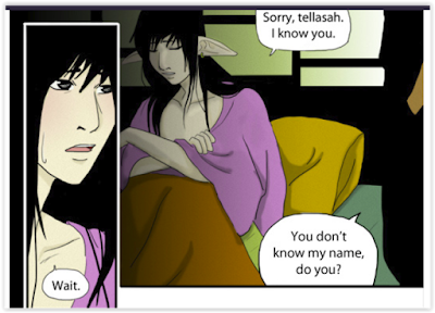
Firstly, a little layout tweaking. Throughout the story, there are many pages where two small panels are offset by a larger vertical panel.

This is fine, but if it's to be done, it must be done in a way that makes the eye flow easily. If the speech bubble on the right-hand panel bottom were the only one in that panel, this example would be perfect. But as the eye must return to the top, confusion ensues. Western minds are trained to read left-right, top-bottom. Change that and watch your readers wince.
Working on the speech bubbles would also be a help. Many of them are a touch shaky and oddly formed, giving the reader a 'cramped' reading experience. I had this issue a great deal as a new artist myself.


 By the way, try as much as possible to create complete circles. Speech bubbles that are cut off here and there harm the aesthetic of the page. A bubble that butts into the edge of the panel should be continued into the gutter. Make the gutter larger if need be, it's worth it.
 Add your bubble tails with a smaller setting on the white brush. Then select your Wand tool.


But there is a fix for this!
I use GIMP as my main program, so I'll display it through that, but every art program I've heard of has a version of this process.
First, create a transparent layer between the art and the type. For the purposes of this example and my laziness, I won't be re-typing the text to show. (by the way many apologies to the creator, I mixed up who's speaking in this panel and due to said laziness decided to leave my mistake in rather than re-make the example. My sloth, my shame).

Using a very large setting on a white, round brush, create circles/ellipses around each text block.

 By the way, try as much as possible to create complete circles. Speech bubbles that are cut off here and there harm the aesthetic of the page. A bubble that butts into the edge of the panel should be continued into the gutter. Make the gutter larger if need be, it's worth it.Add your bubble tails with a smaller setting on the white brush. Then select your Wand tool.
Select the entire transparent layer by clicking it with the wand tool. This will outline your bubbles in a dashed line.
Now, stroke the selection. (particularly approps for this story heh heh ;) )

Always stroke with the paintbrush or pencil tool set to the line thickness you want. This outlines all your bubbles in a nice black line.
If you forget to use the paintbrush or pencil and simply stroke with the automated line size, the lines will be pixilated, as below.

If you did that by accident, never fear. Just hit 'blur', then 'cartoon' or 'photocopy', which will smooth out the lines.
And there you have it:quick, good looking bubbles!
The Revue
A lovely wander through a well built world, with a few laughs along the way.

No comments :
Post a Comment
Drop us a line!